Her is
The largest community for lesbian, bisexual and queer womxn to find connections, and themselves. It’s an international app and has 3+ million users actively using it to meet womxn in their area and to discuss topics on community boards worldwide.
My Role
Founder Robyn Exton hired me to completely reimagine Her’s brand from the ground up. We began by composing research and insight with strategy team Wolf & Wilhelmine in New York and solidified a plan for who and what Her would be positioned for. From there, I acted as the sole designer and director for a strategically-charged, new creative identity for Her that would allow them build spaces for queer women to connect emotionally, intellectually and sexually for years to come. This work seeks to create a space where womanhood and queer identity are superpowers, where experience and fluidity leads to growth and where queer womxn thrive in abundance — of choices, opportunities, and connections. Photographed by Kathryna Hancock.
I Worked On
Branding
- Brand Identity
- Tone of Voice
- Art Direction
- Photoshoot Production
- Copywriting
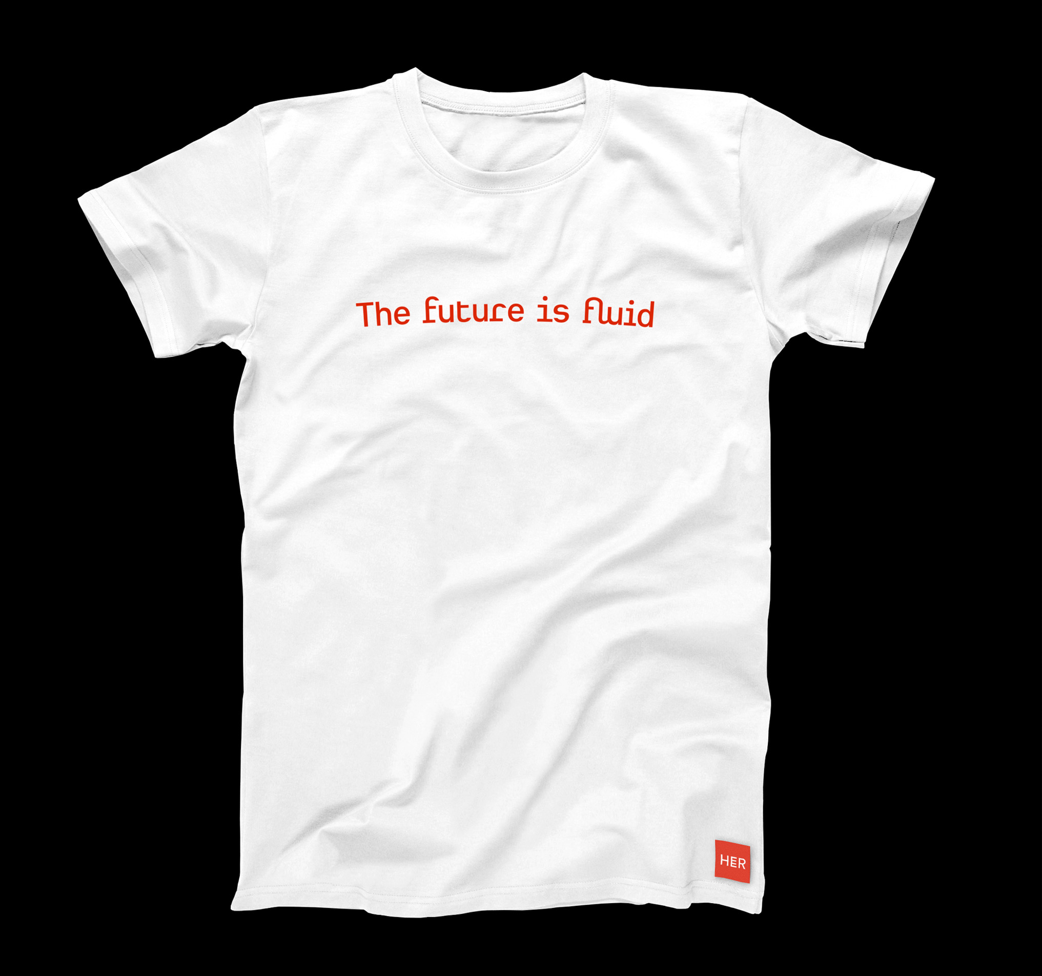
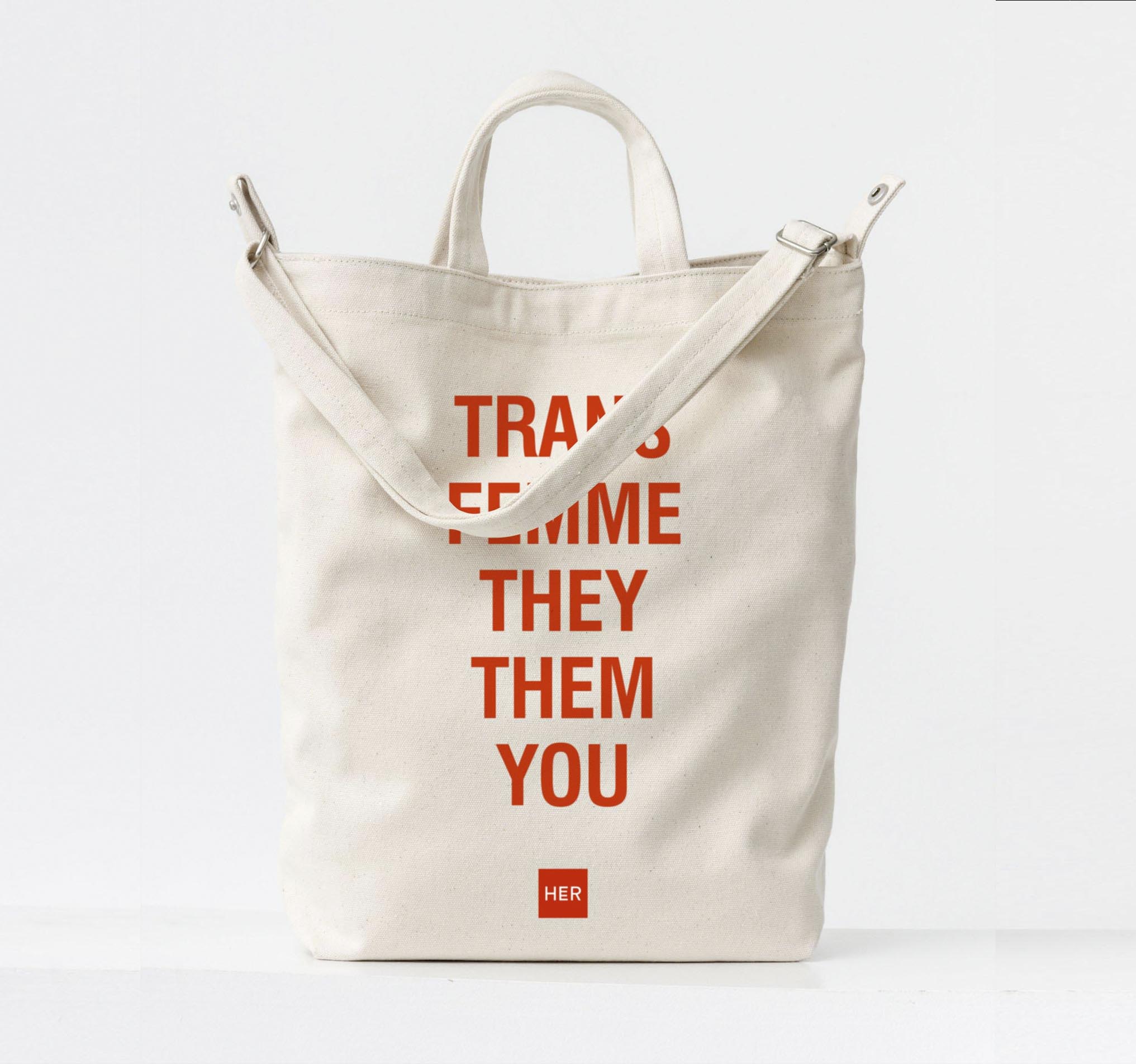
- Merchandise
Digital Product
- Interactive Design System
- App and Web Design
- Digital Design Direction
- UX Concepting
Activation
- Social Strategy
- Event Design Direction
- Advertising
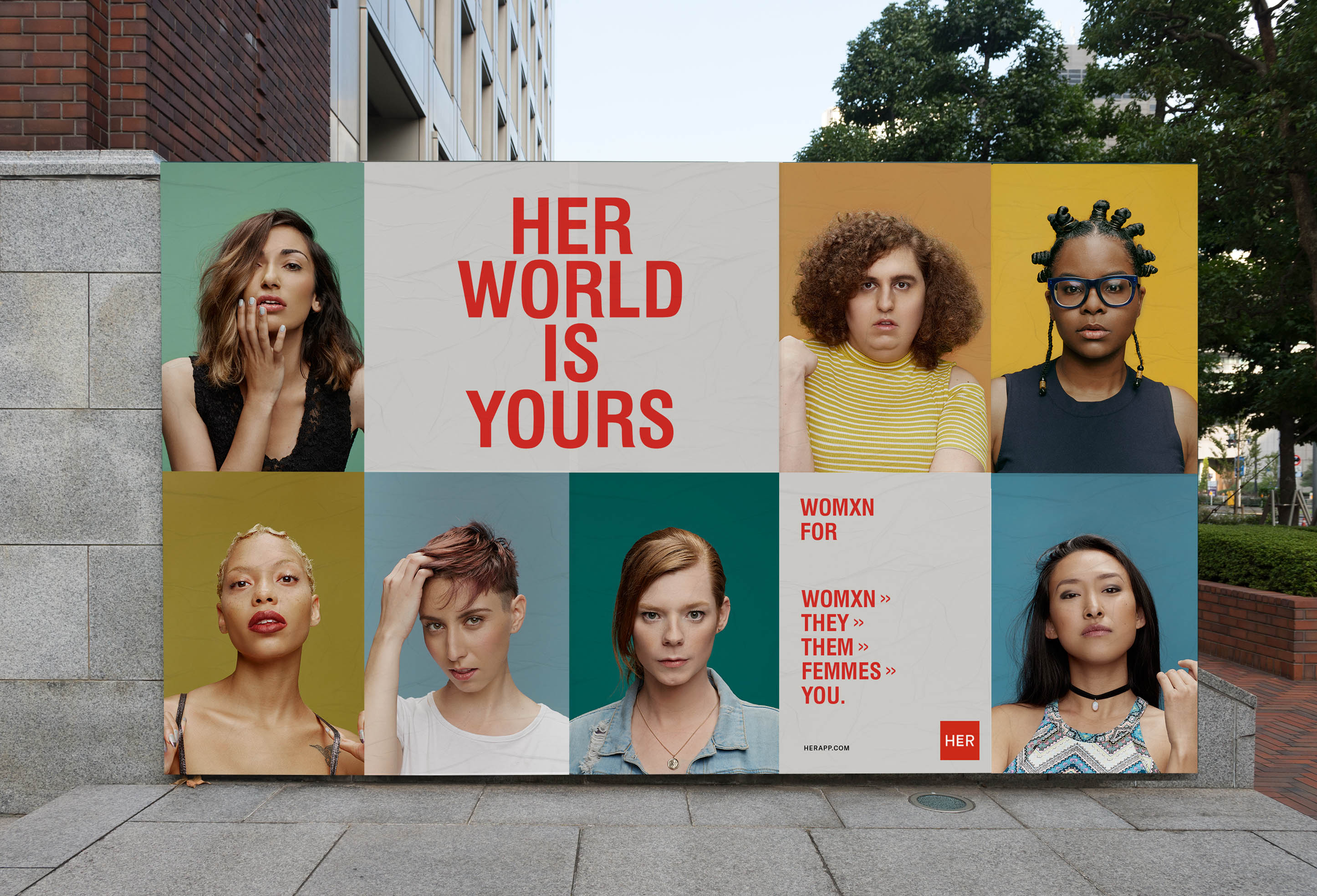
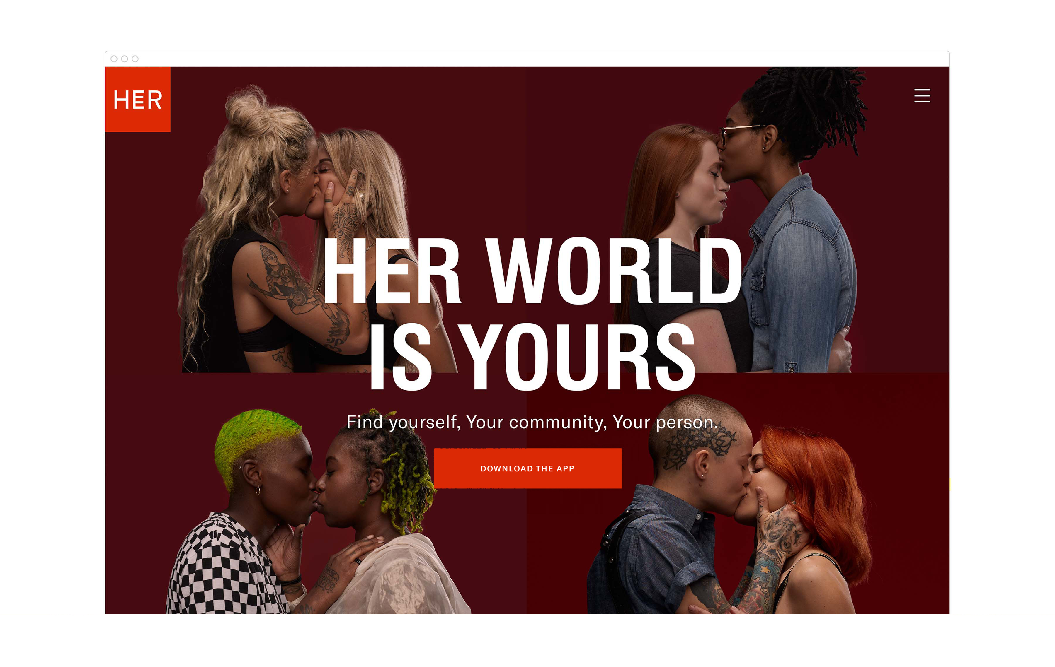
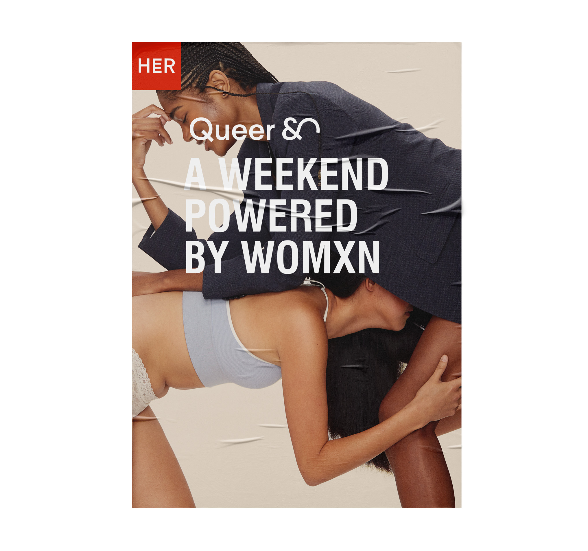
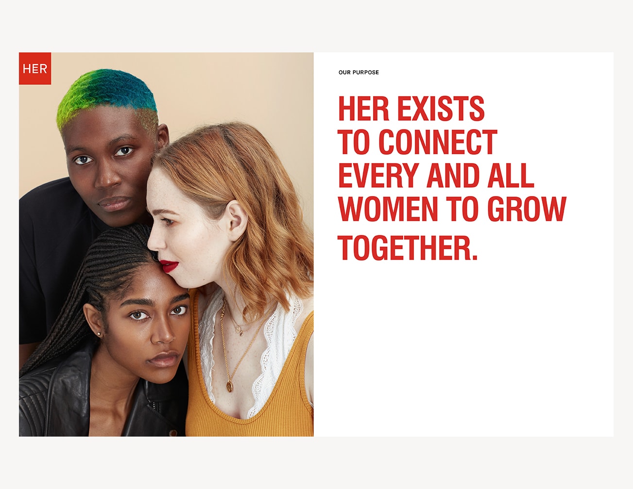
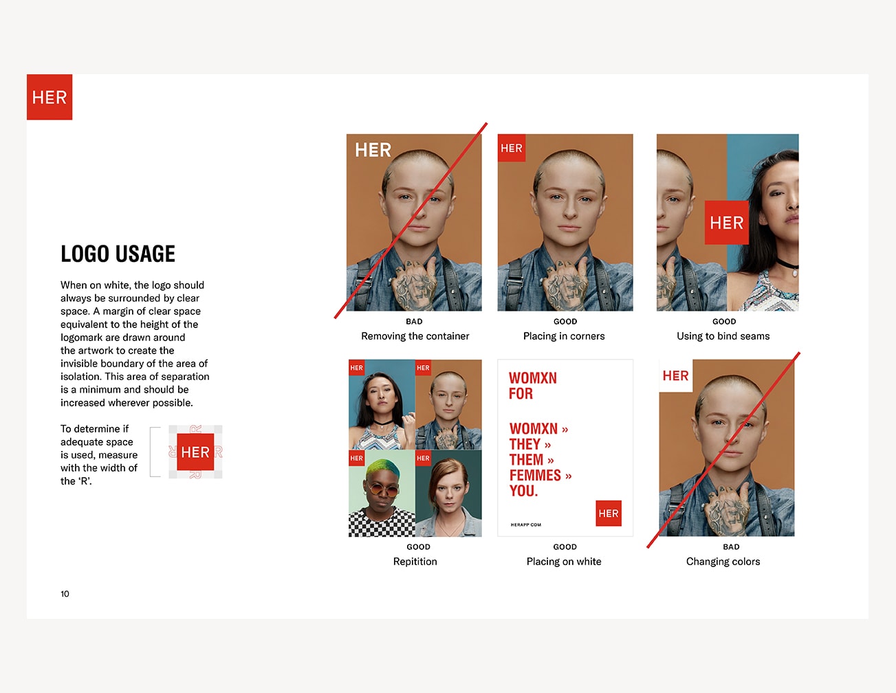
A FLUID FUTURE
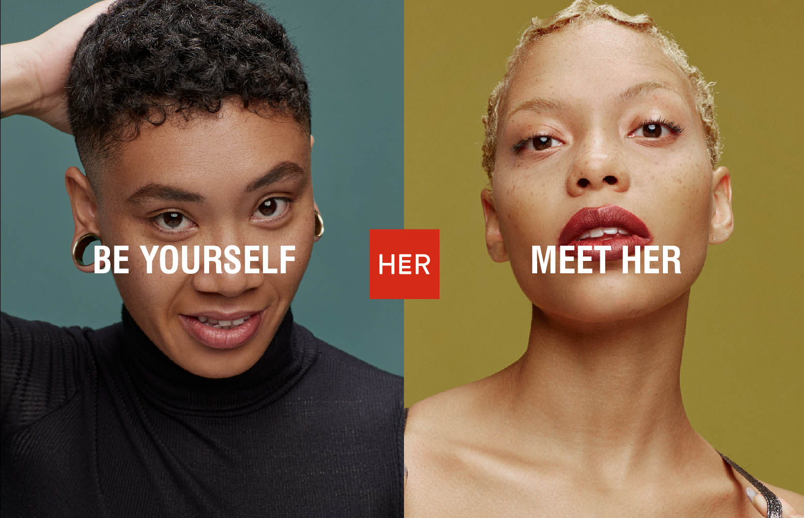
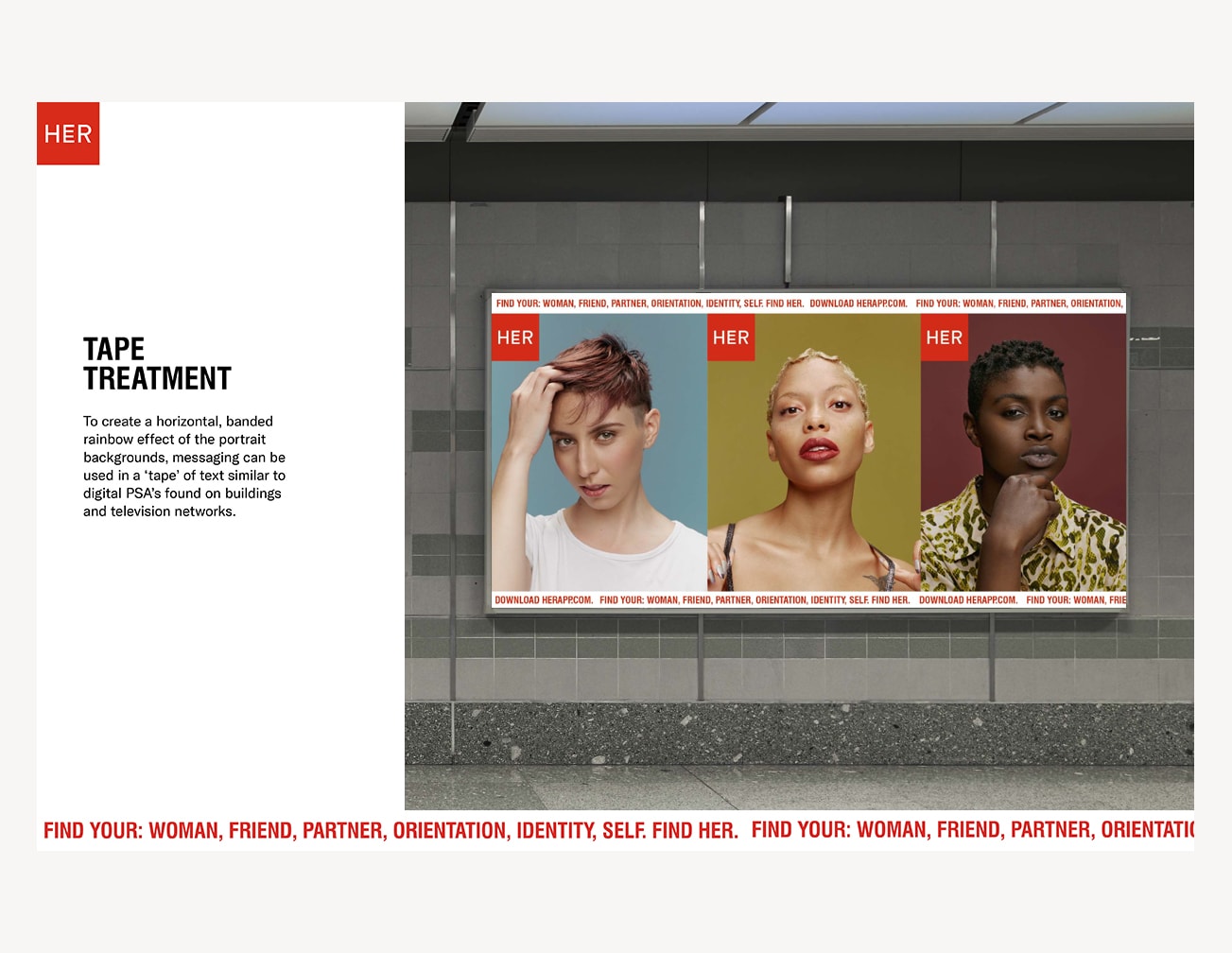
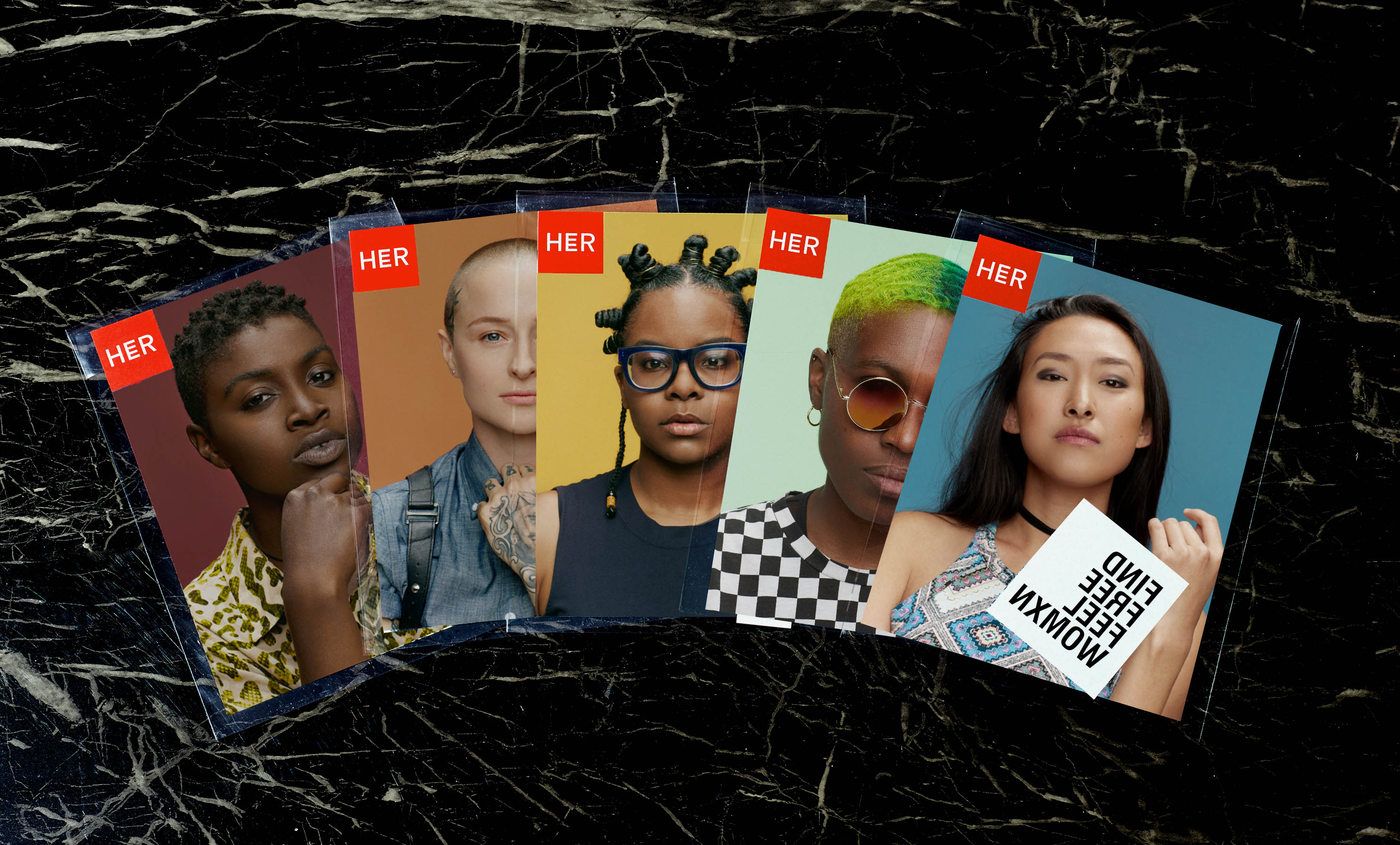
I designed the logo as a symbol of the future being unapologetically fluid. It takes the standard orientation of the center letter, ‘E’, and makes it a symbol of fluidity and expanding possiblity; It asks you to look twice because things are not as they might first appear to be. It's retained in a red, PSA-like badge so that it always speaks as loudly as possible and never becomes shy or apologetic in nature.
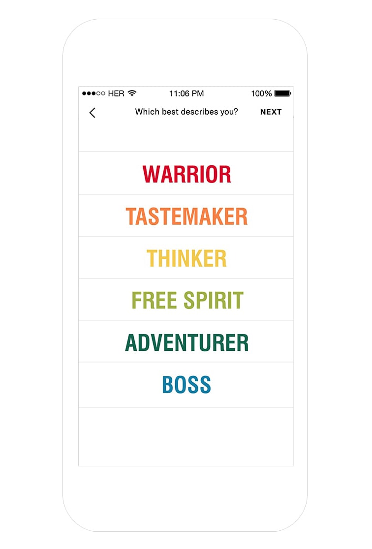
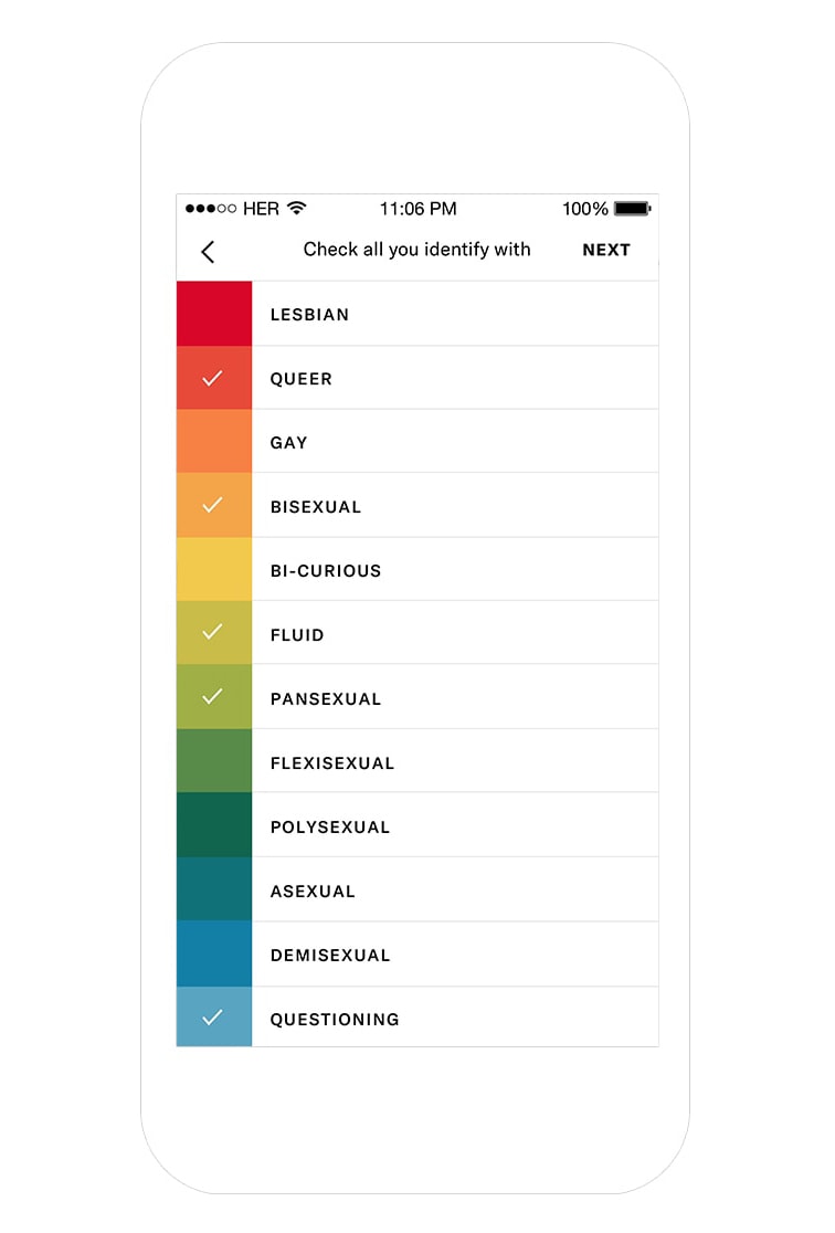
App Concepting
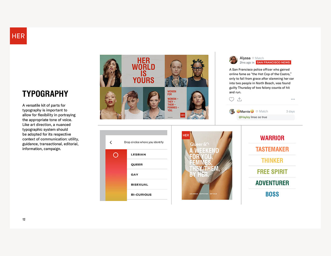
While working through the design system, I concepted screens that helped the onboarding to become more inclusive, fluid and personally engaging, rather than requiring a user to label themselves in a way that society too often asks of them.
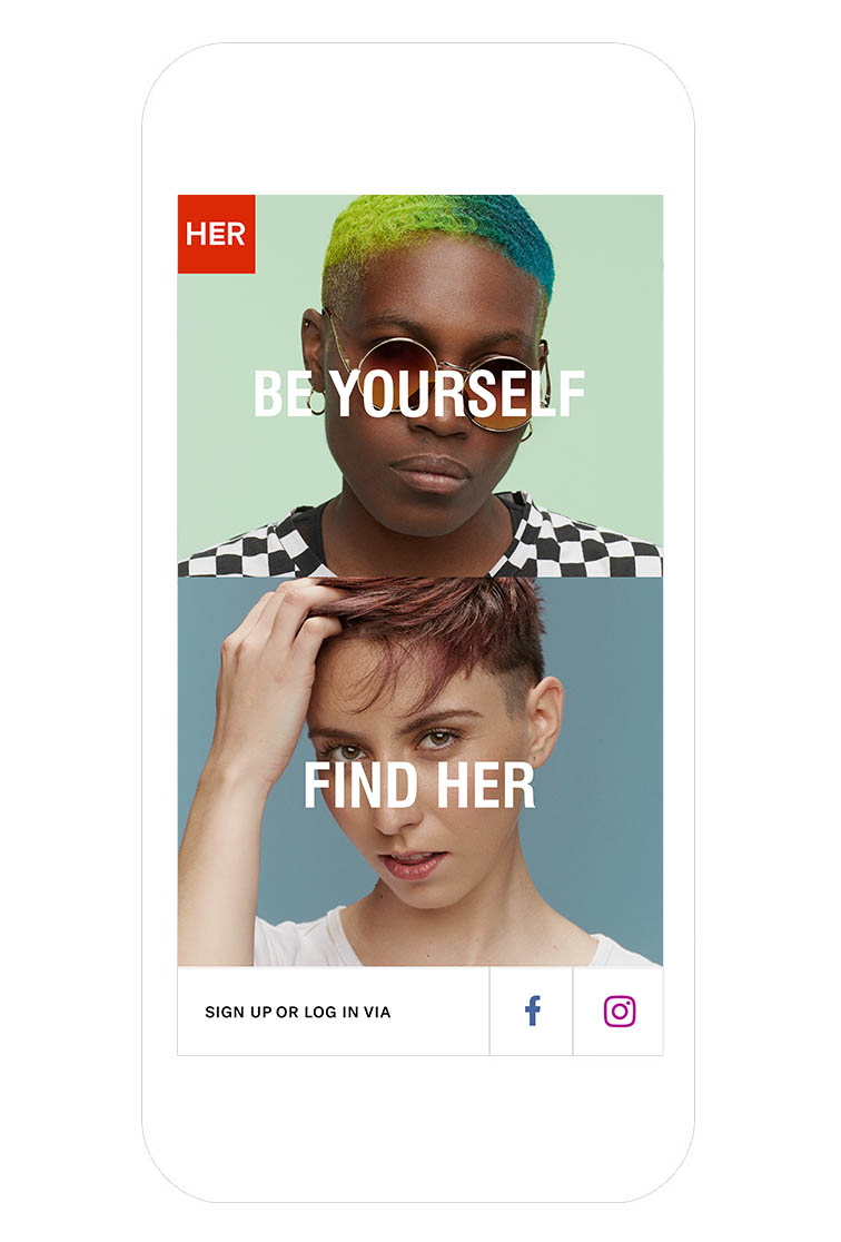
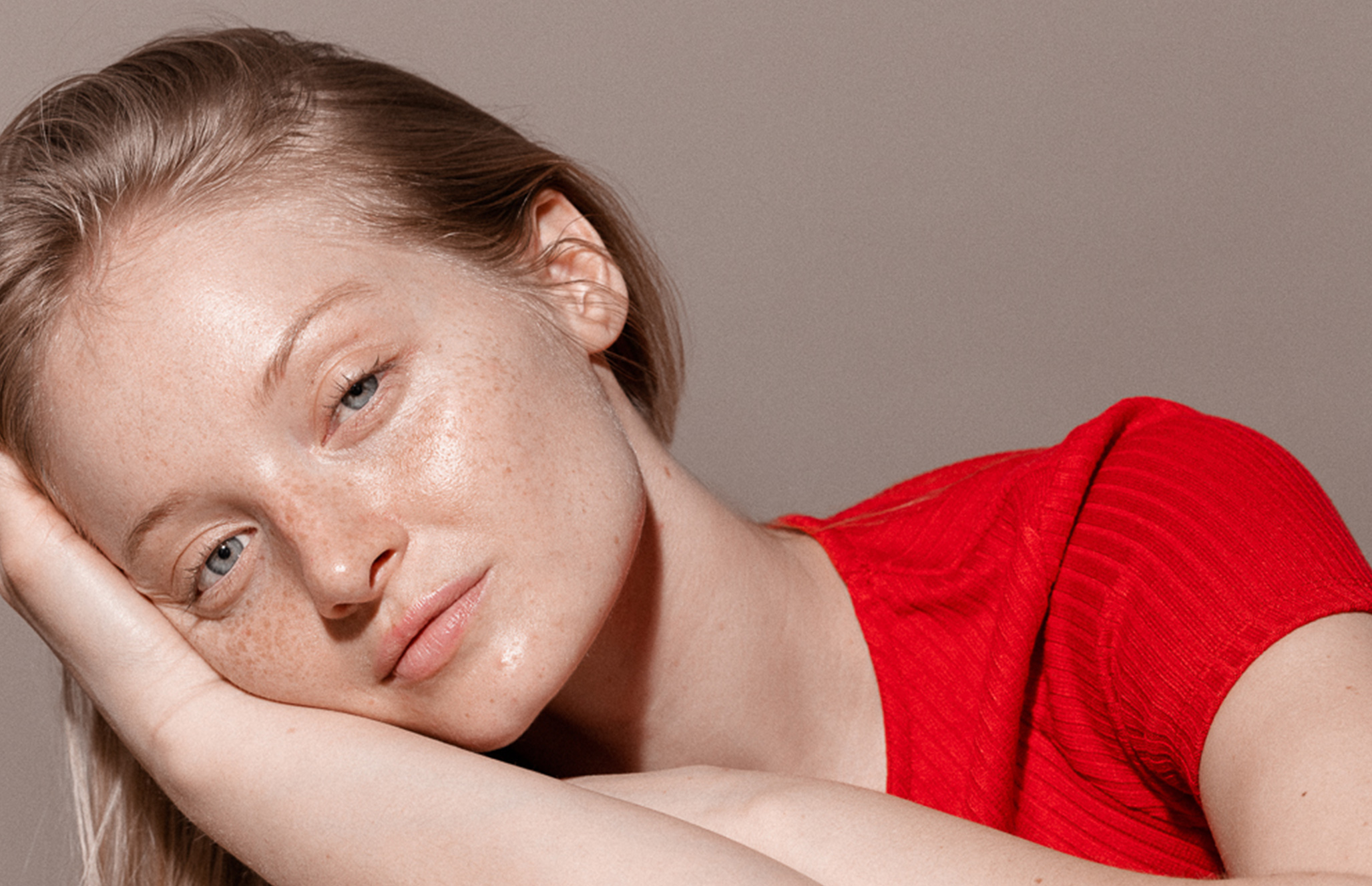
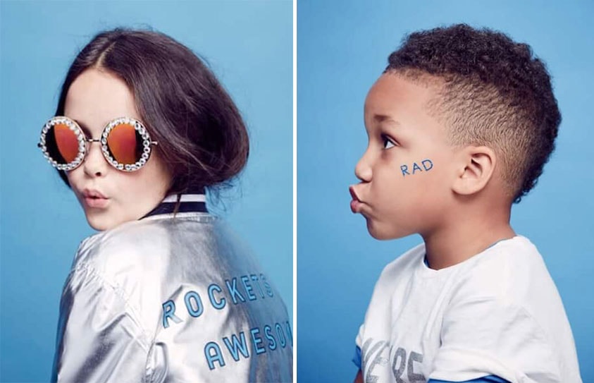
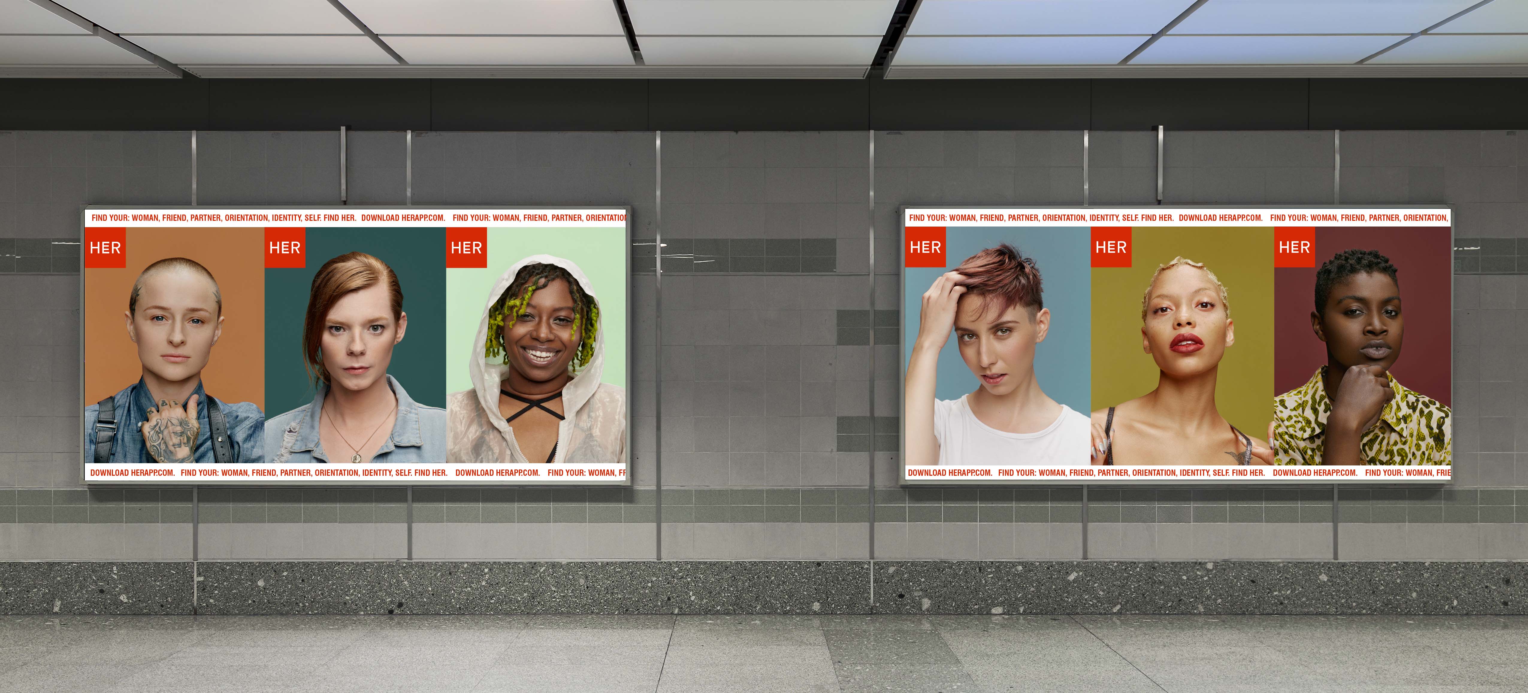
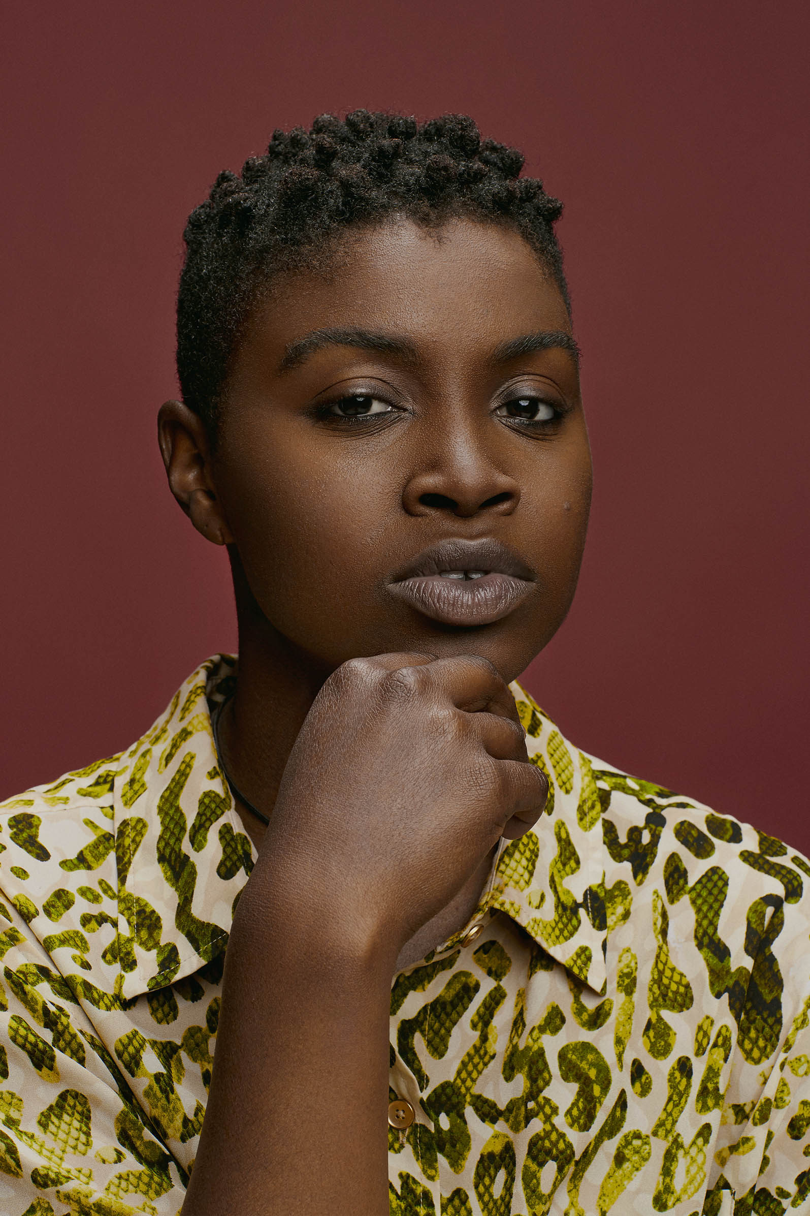
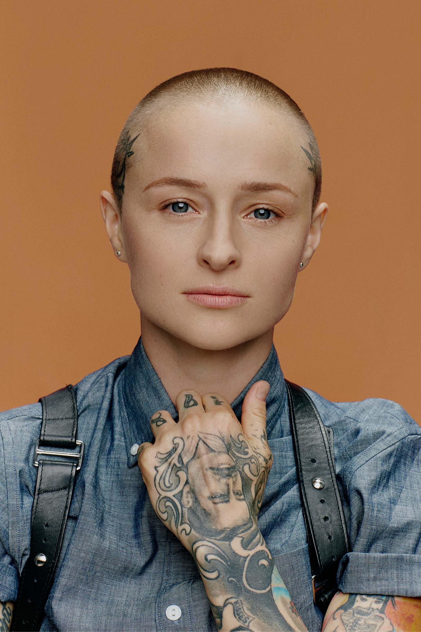
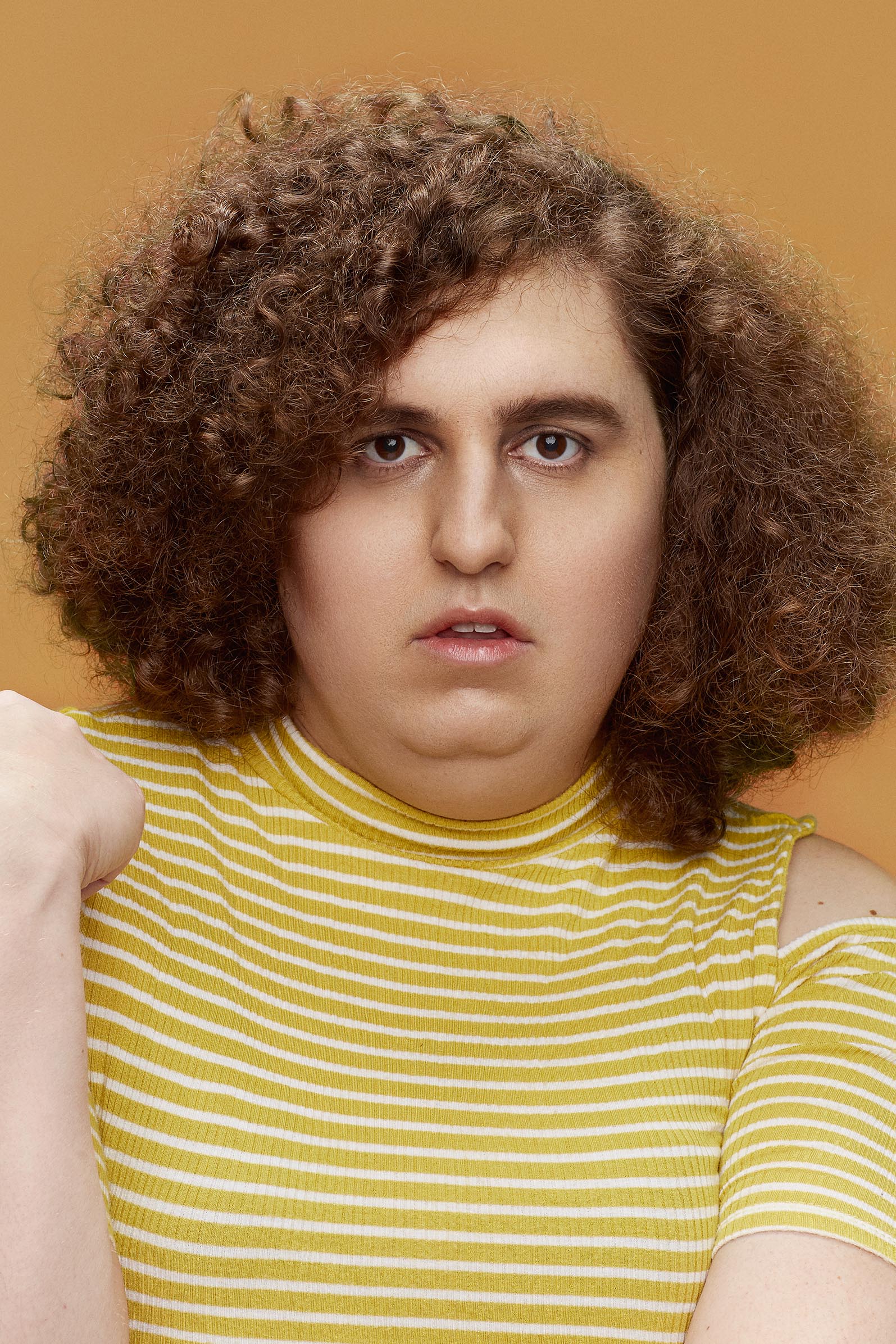
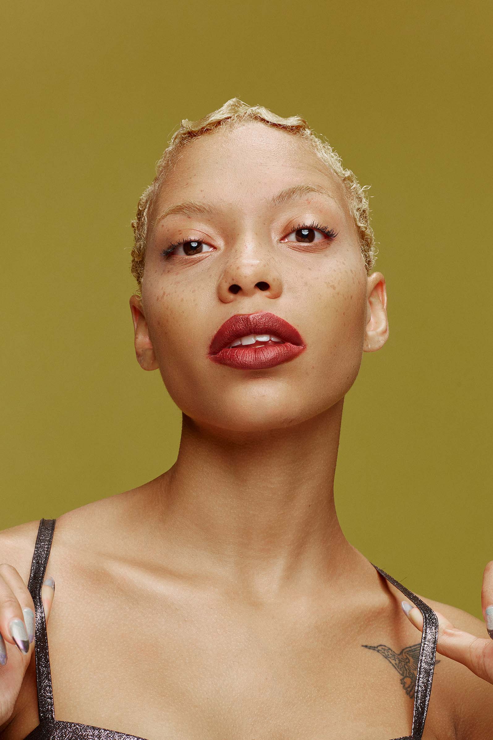
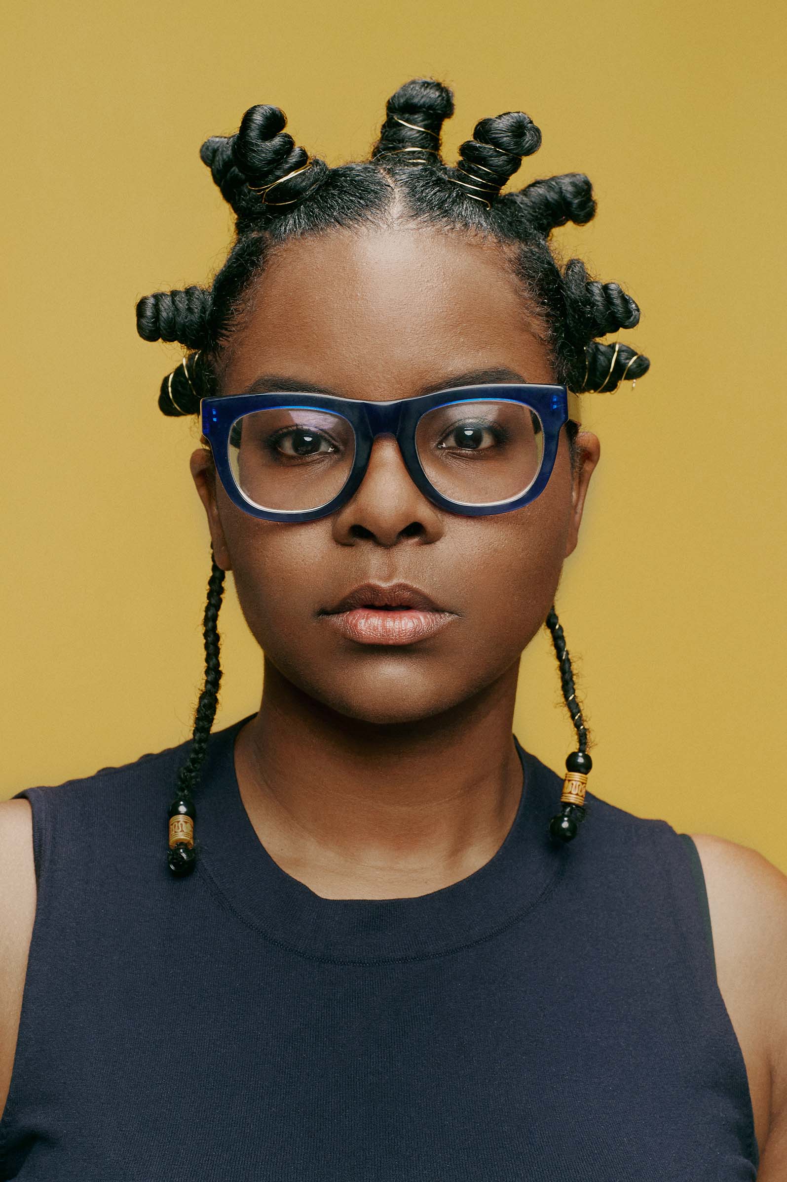
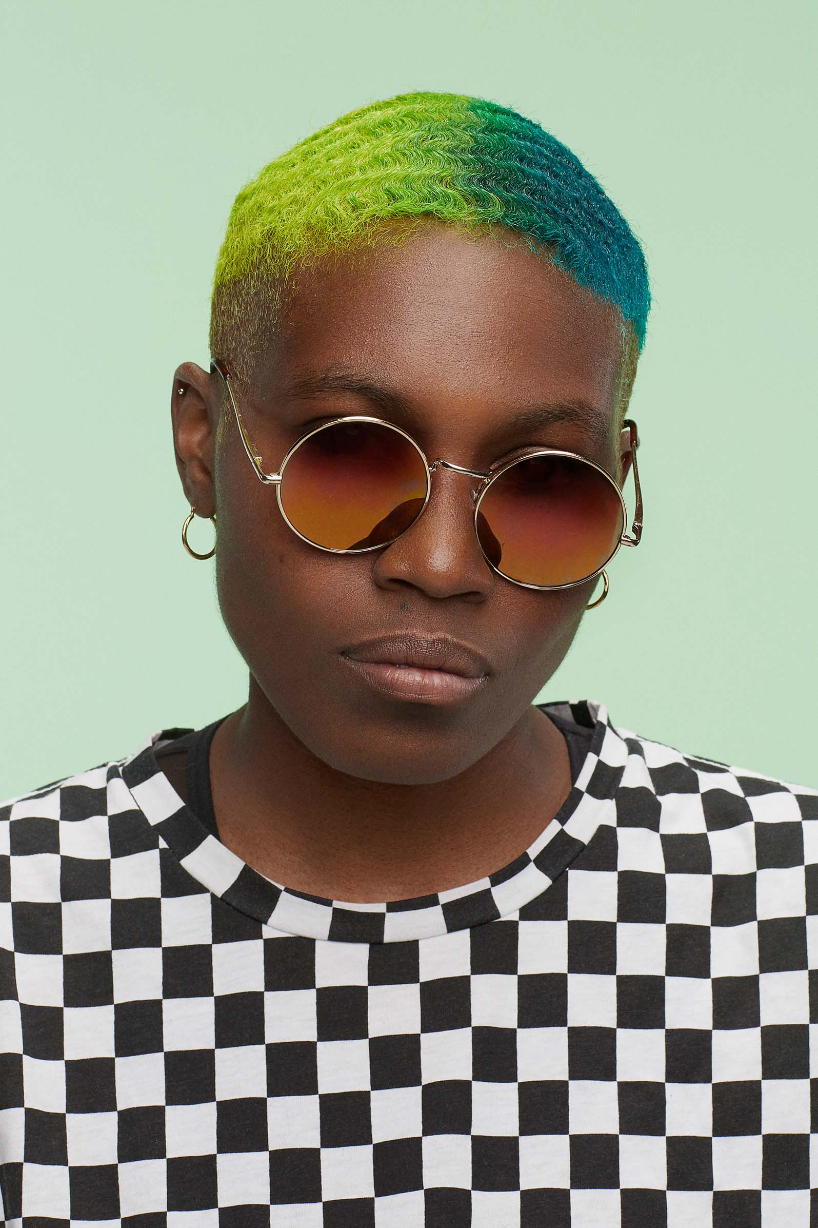
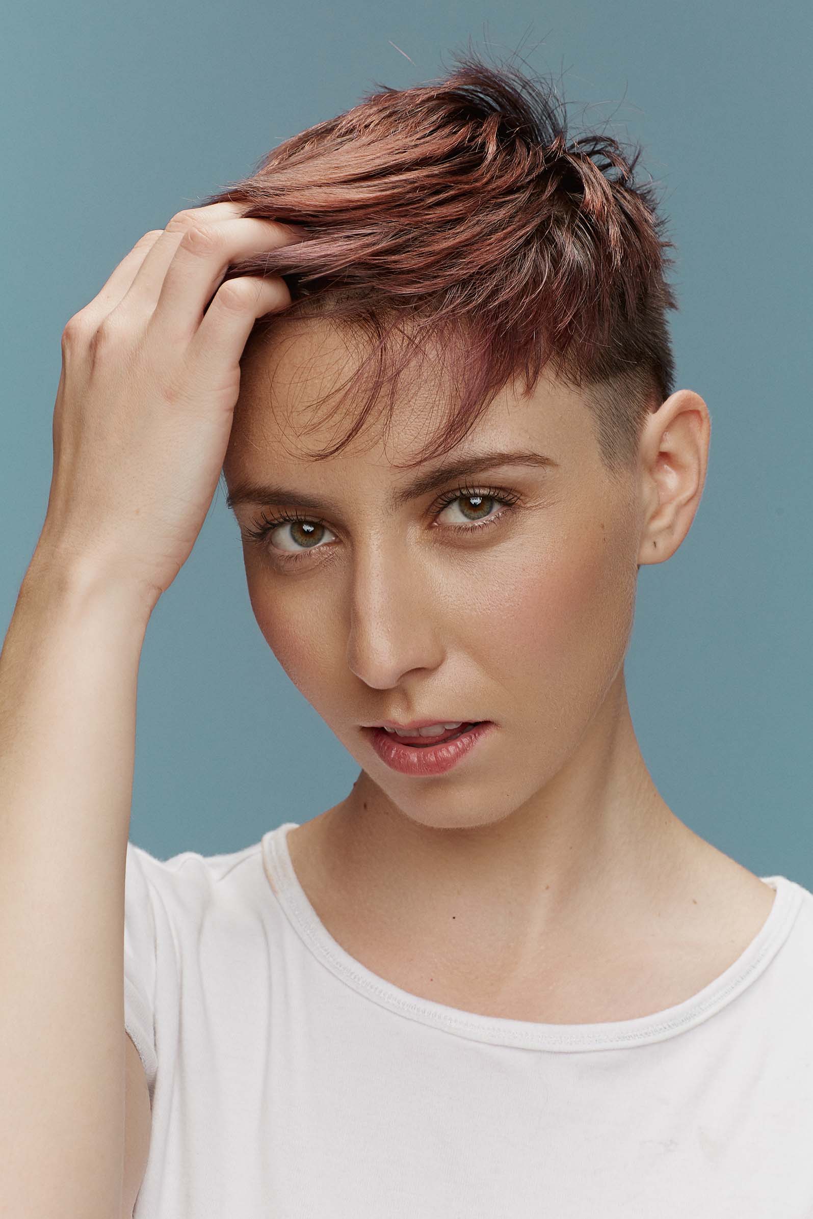
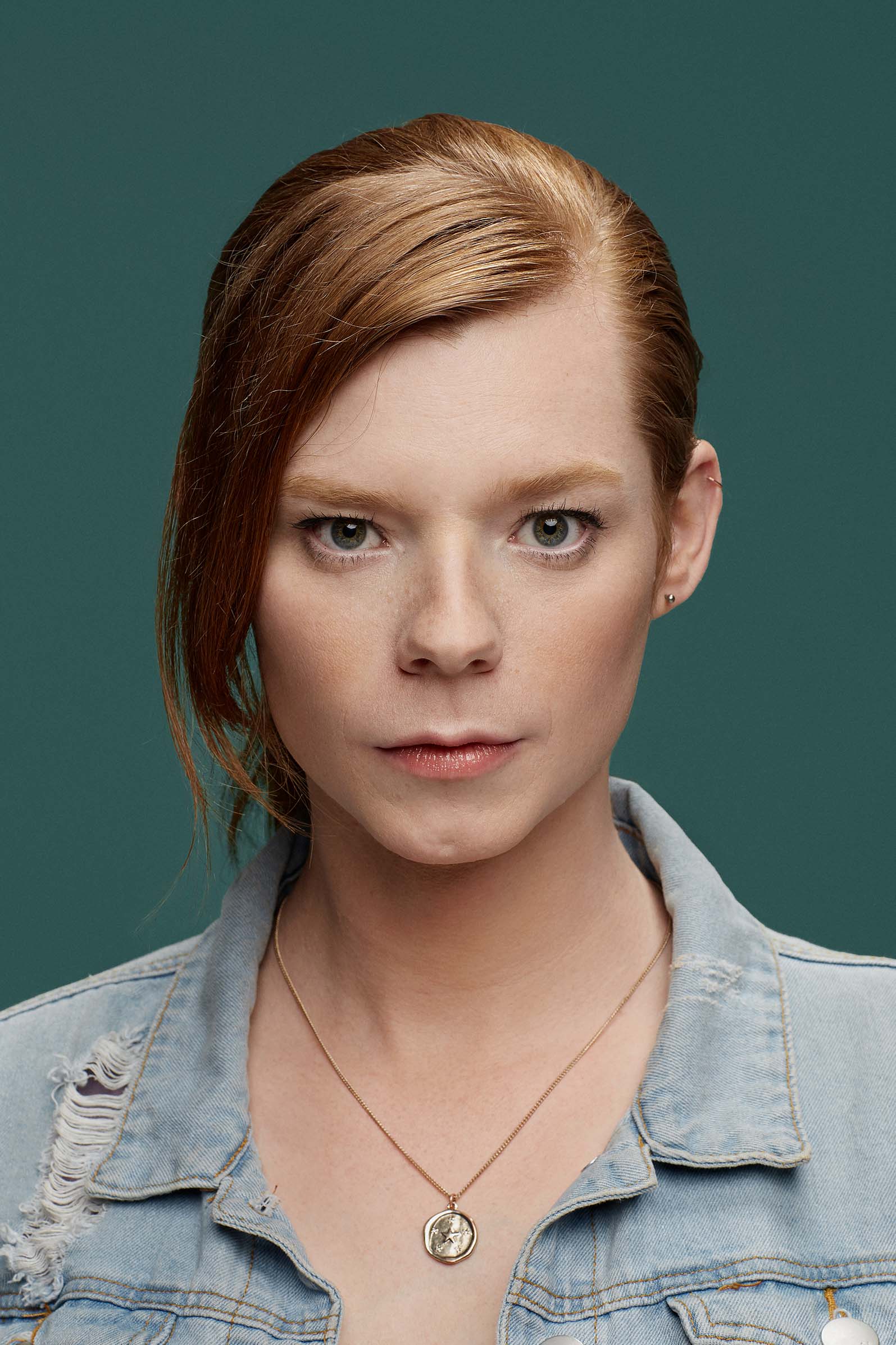
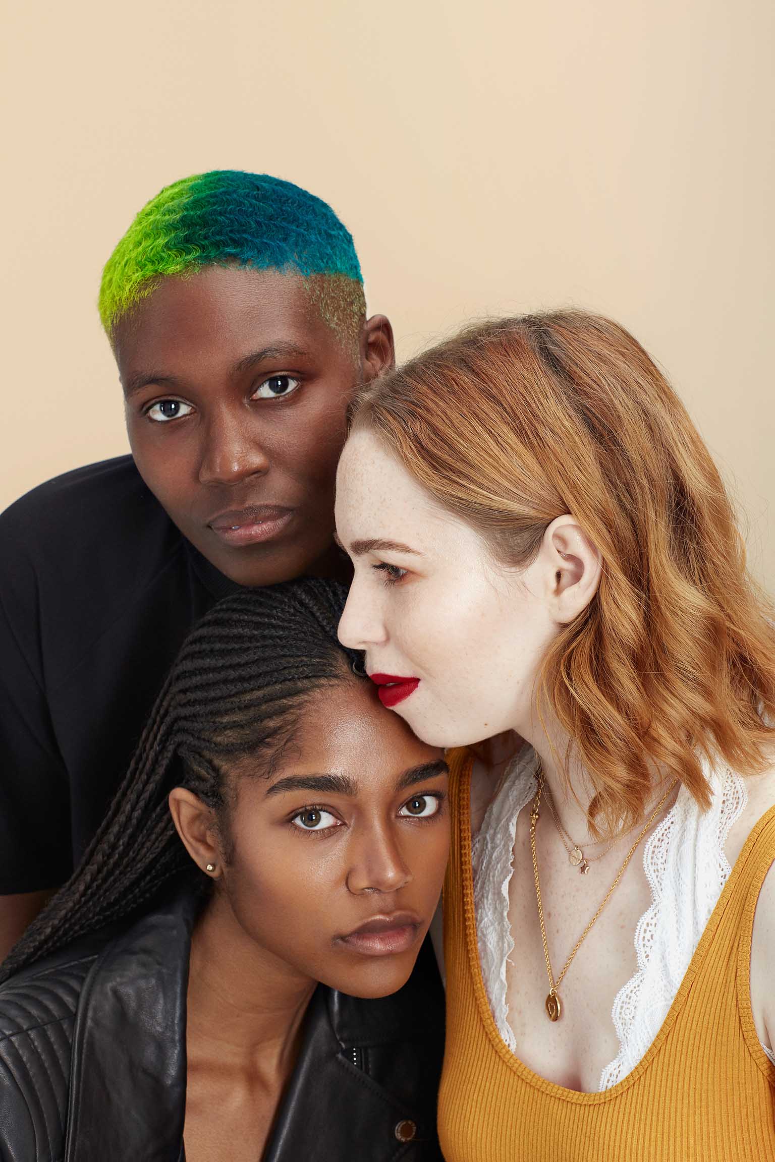
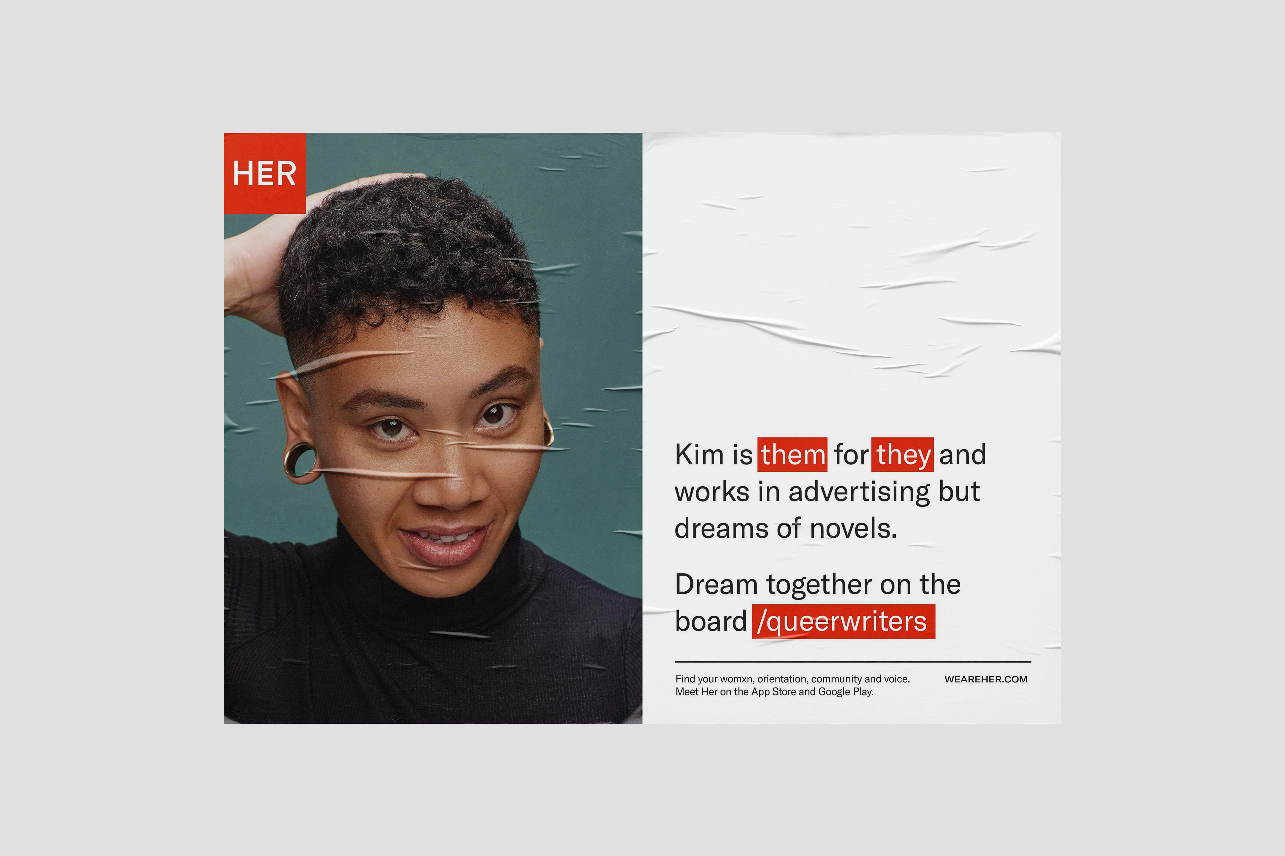
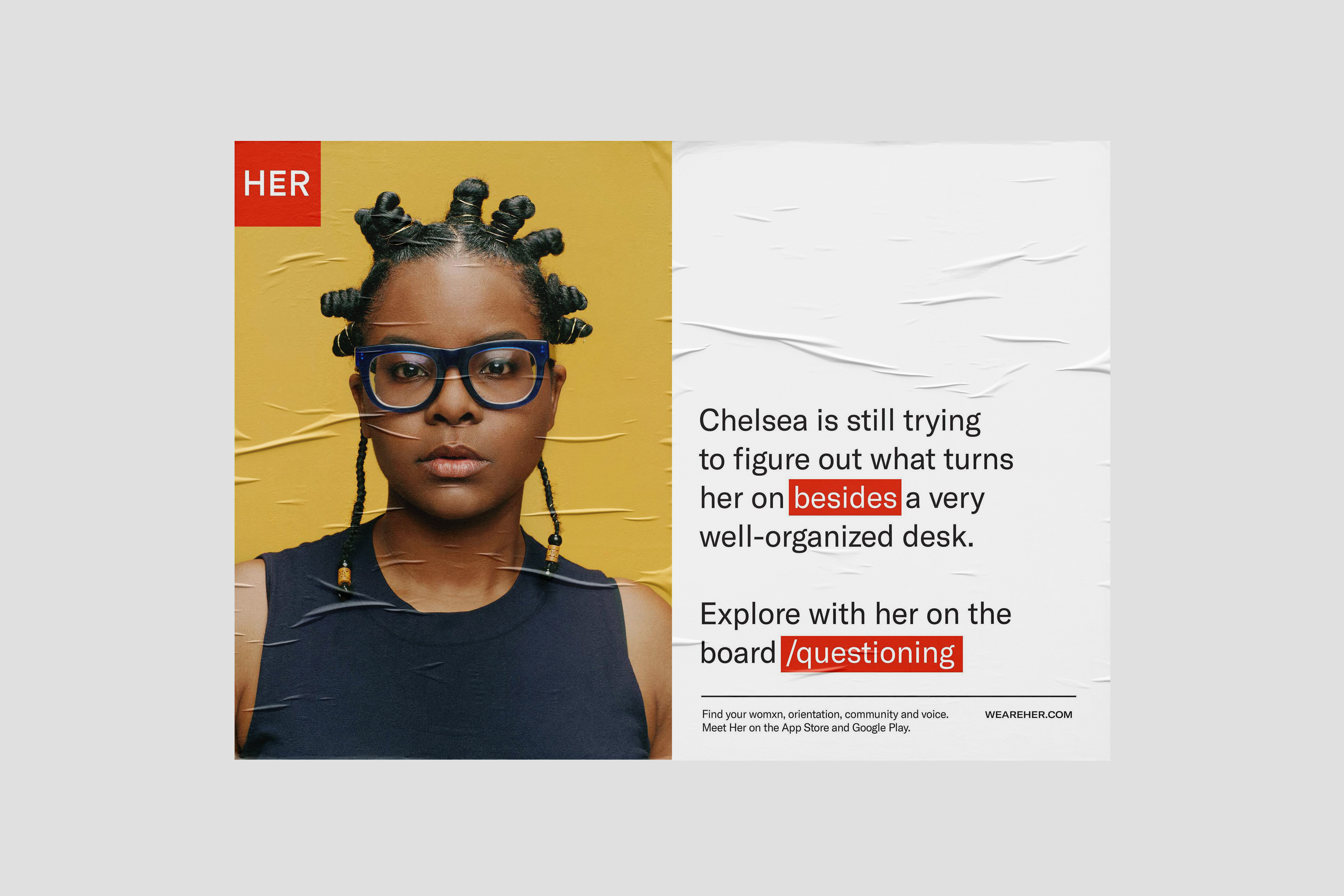
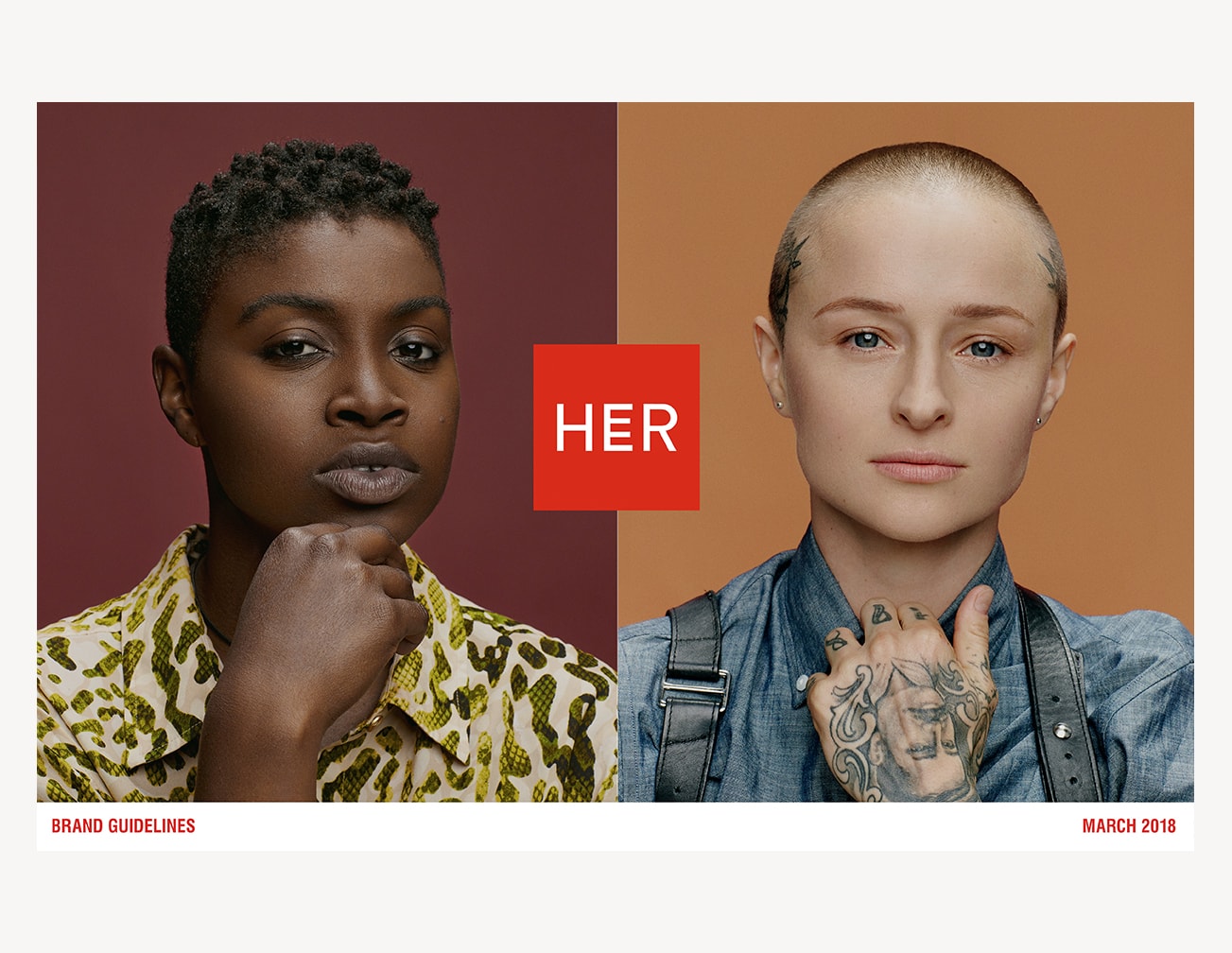
Portrait Photography
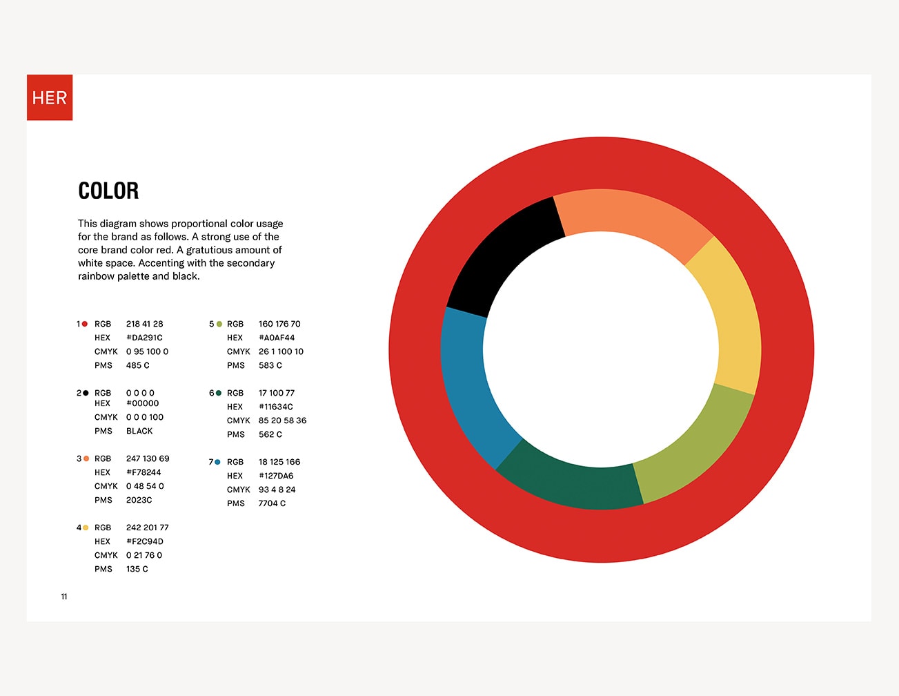
The brand’s signature photography is portraiture that employs a rainbow of seamless backgrounds, so when combined they create a spectrum effect of both color and identity. The casting was of real members of the community, no models.
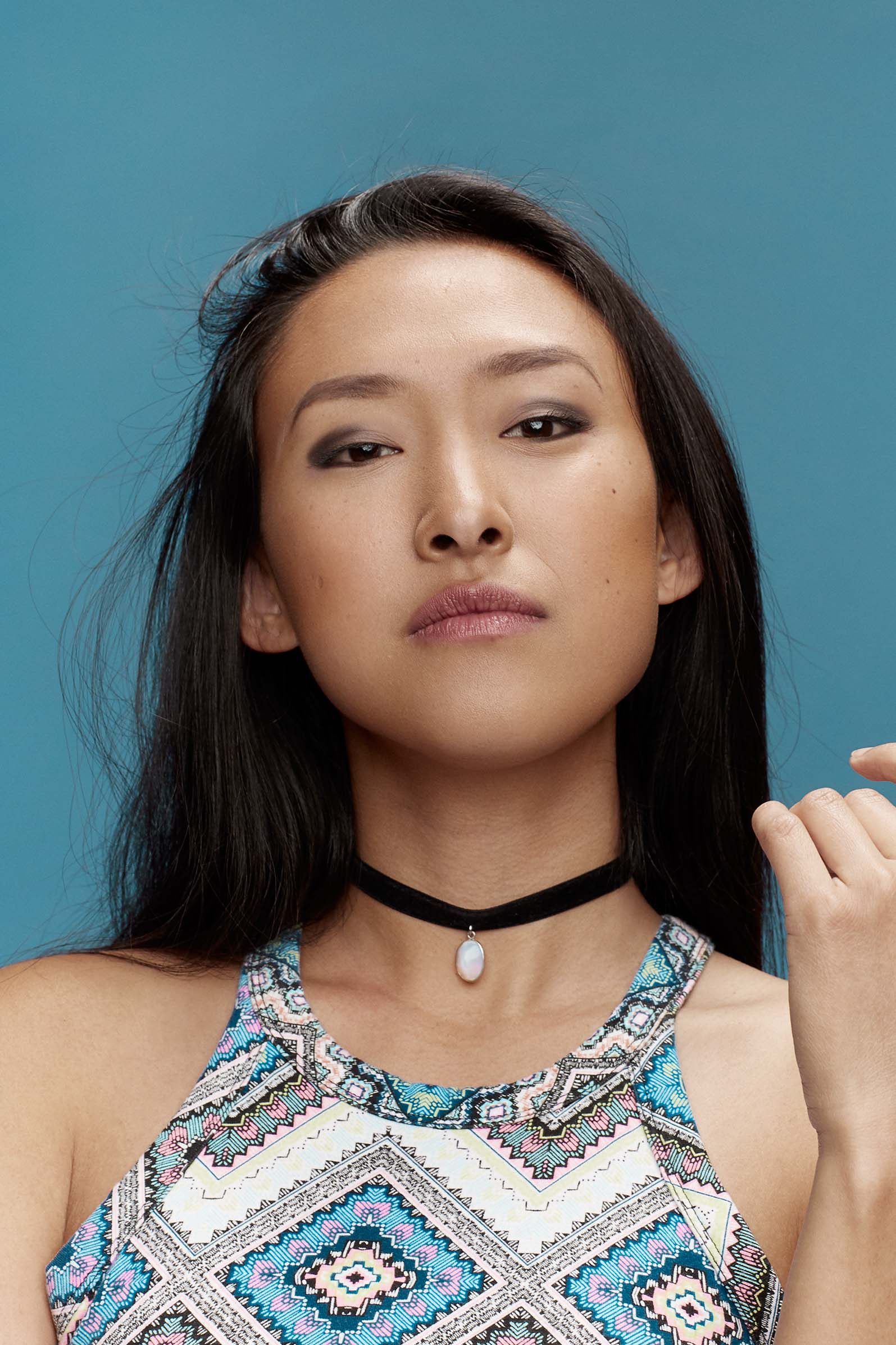
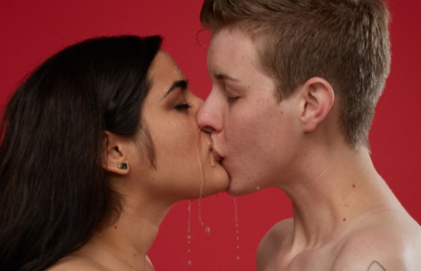
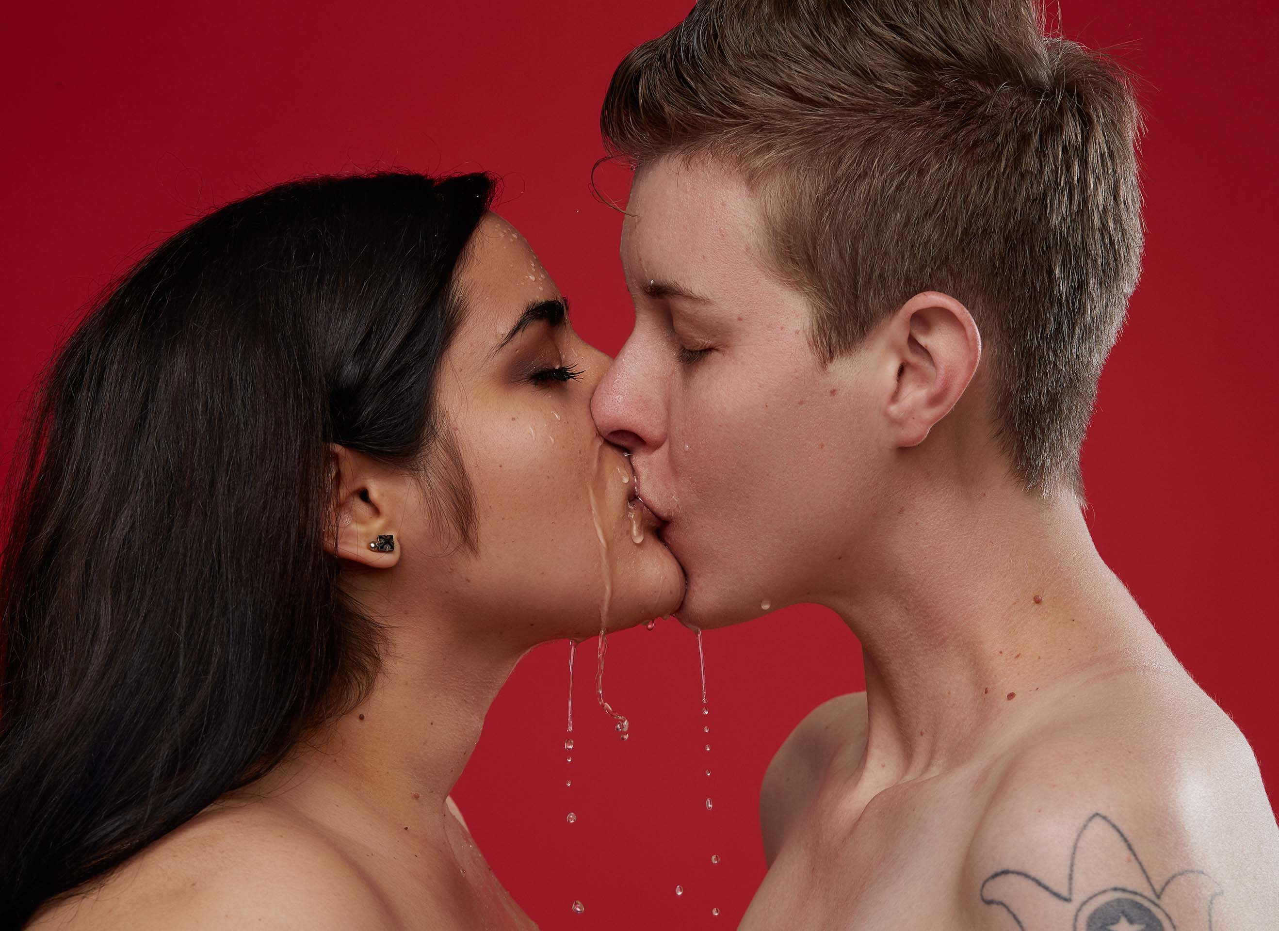
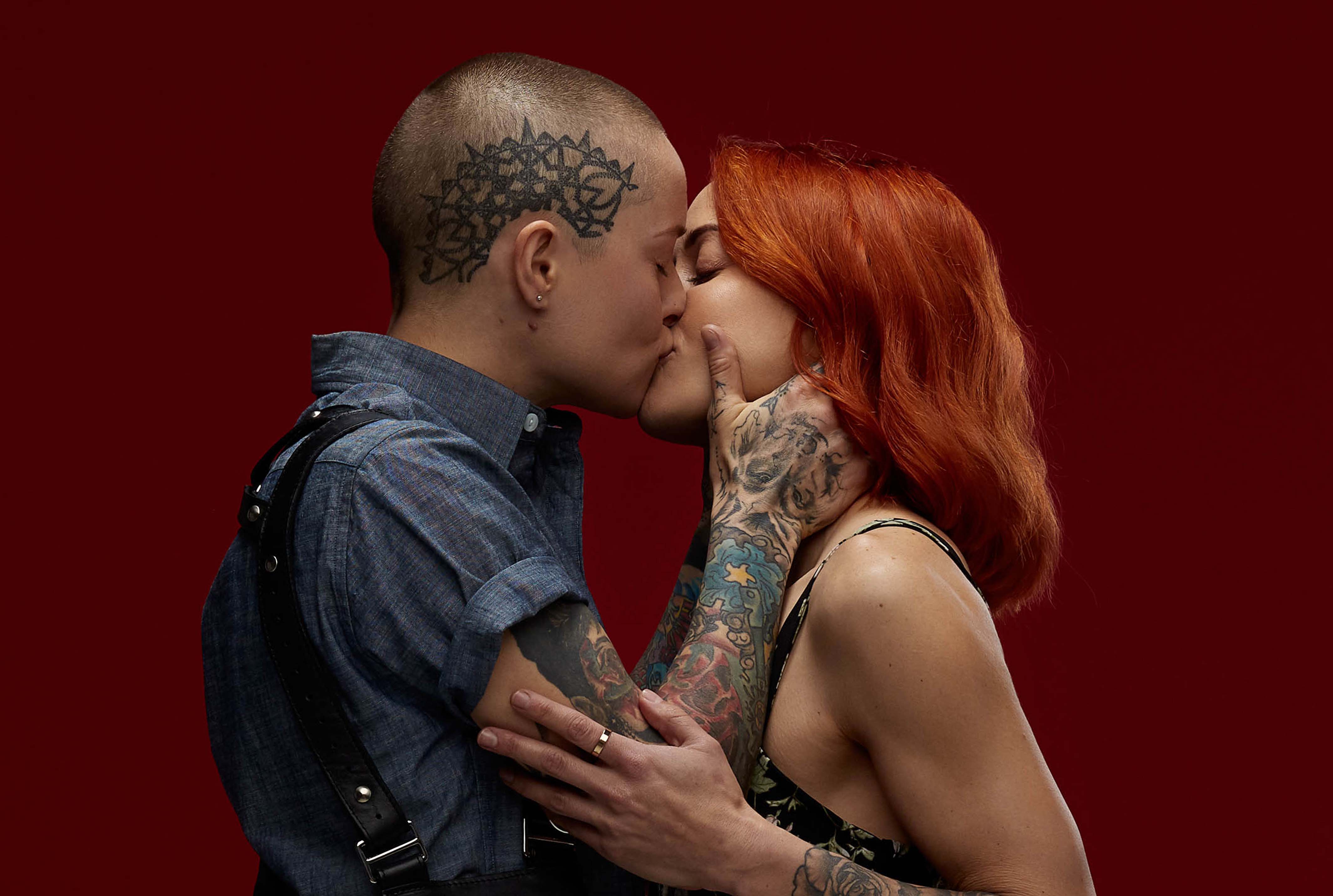
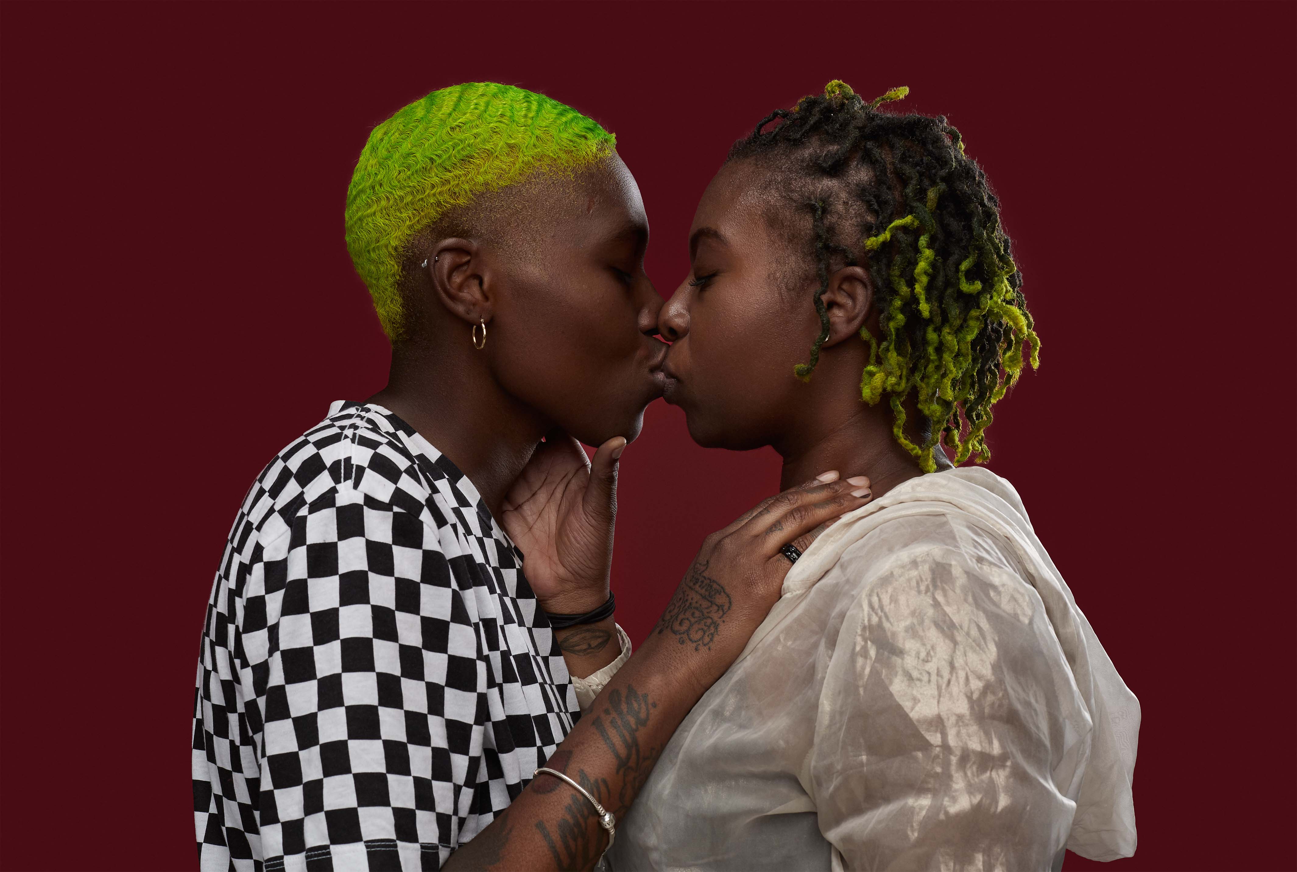
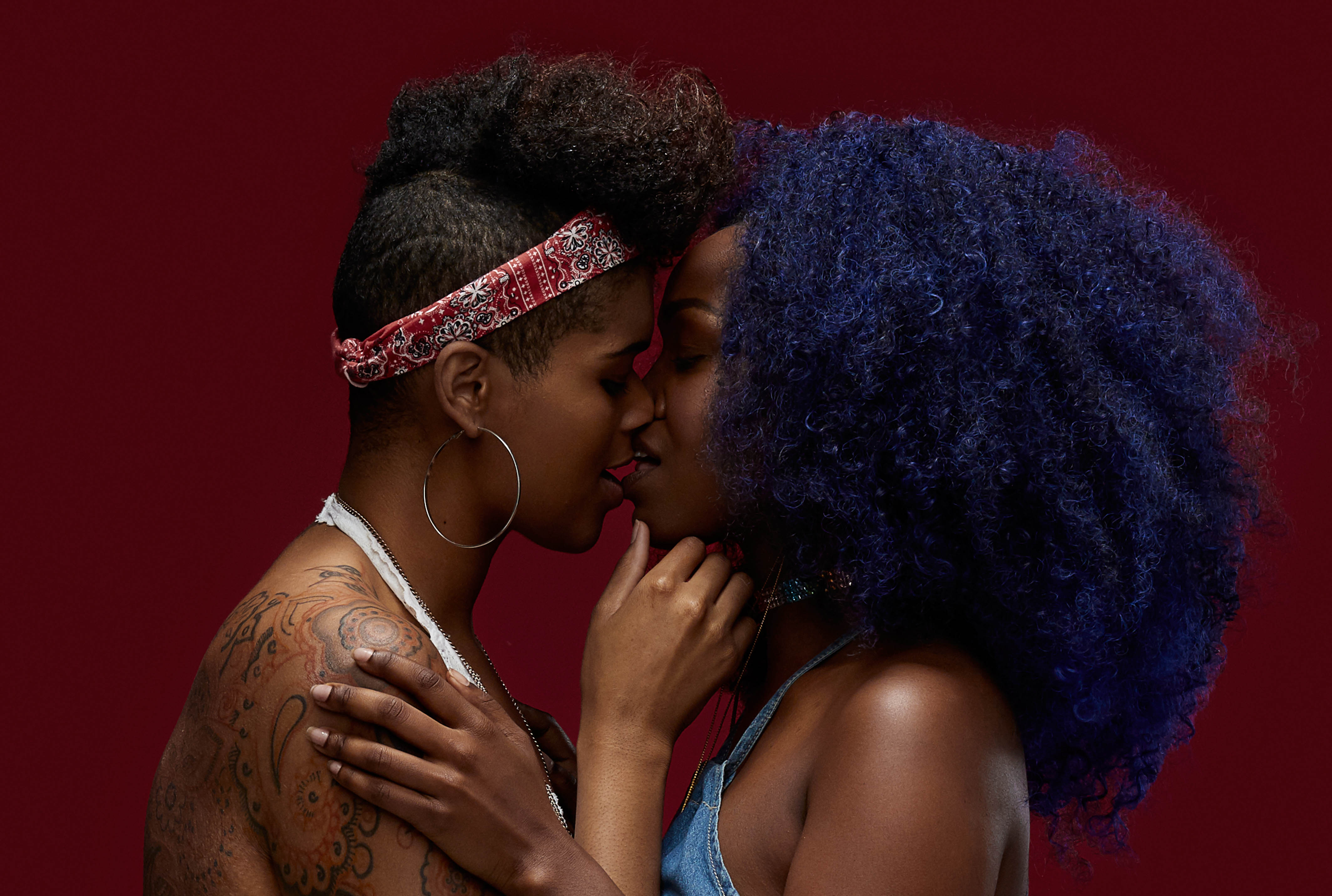
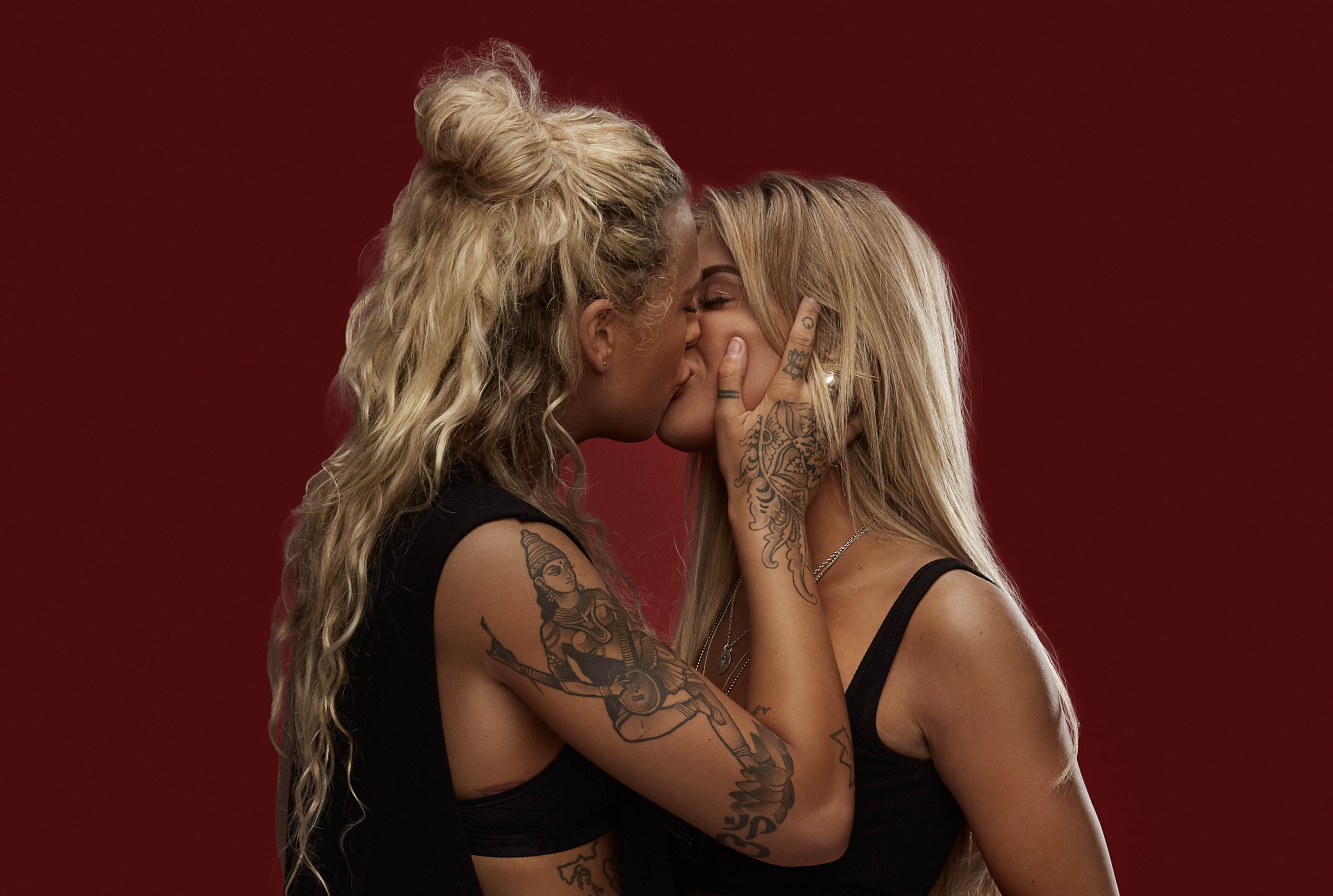
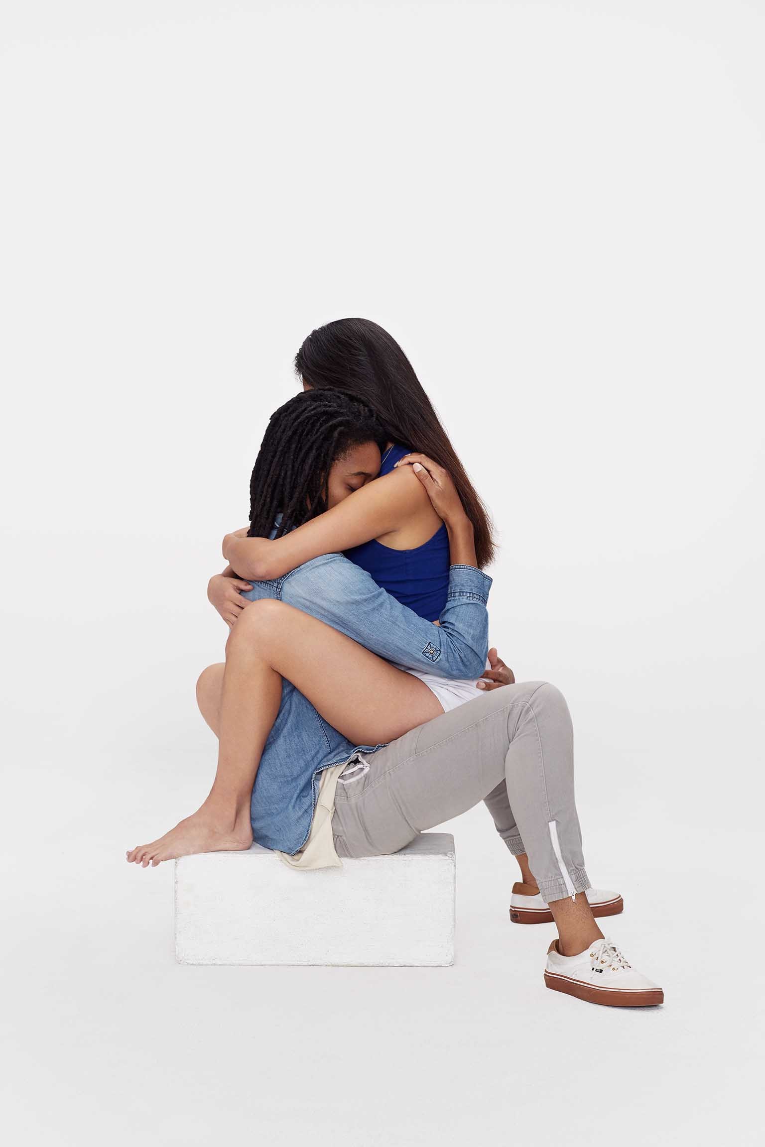
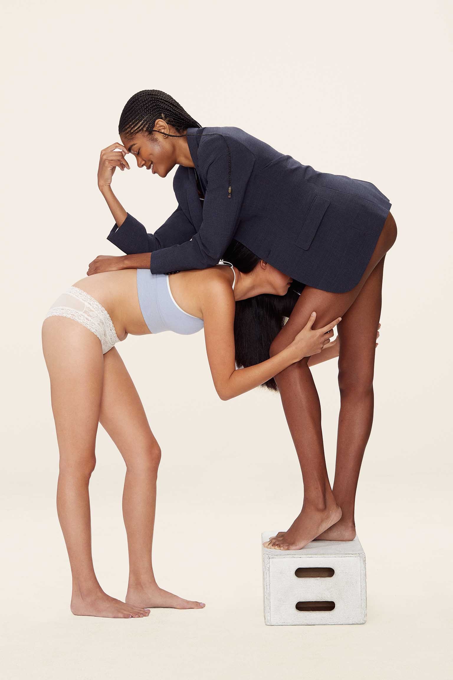
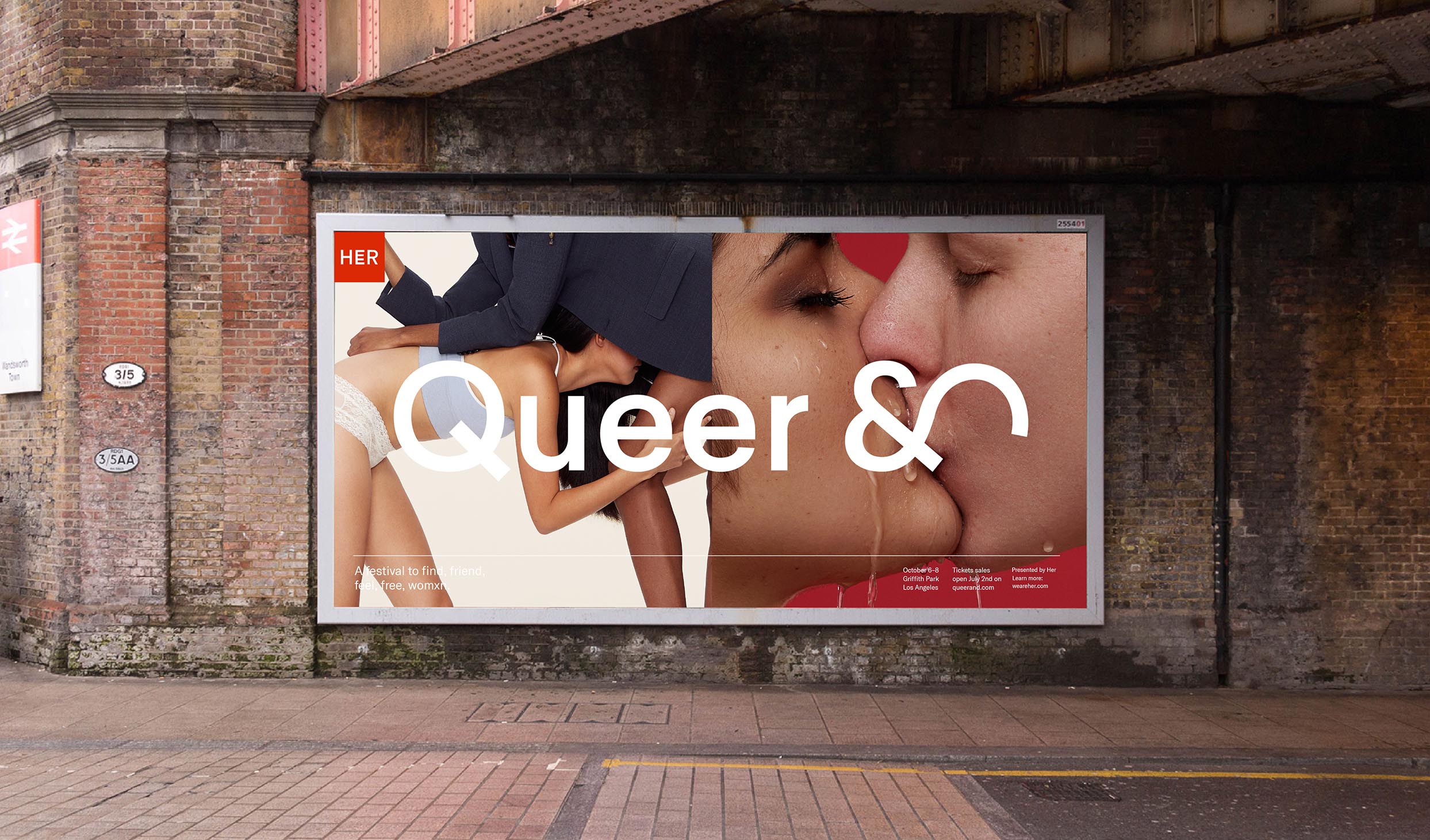
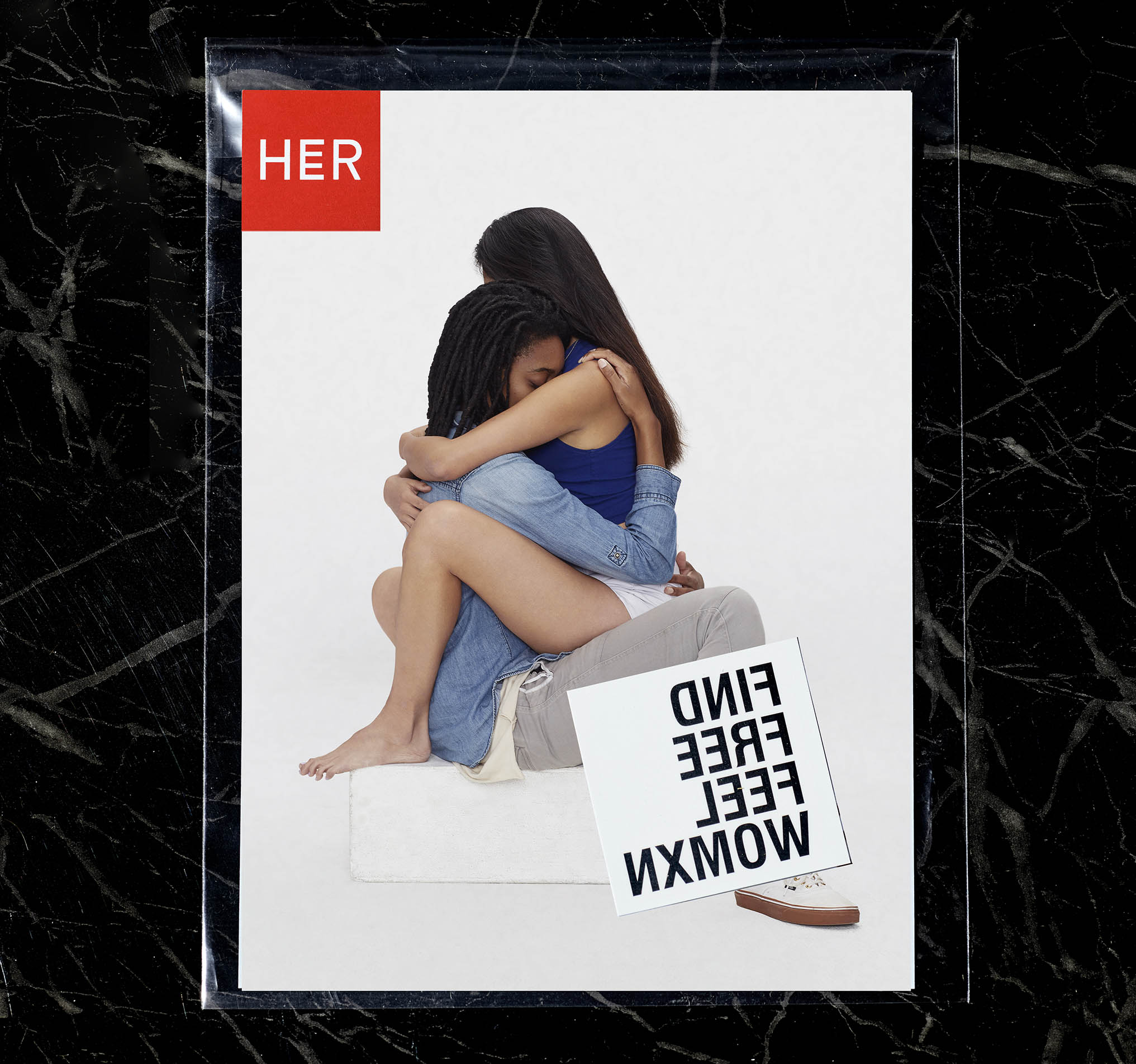
Couples Photography
These are real couples from the community helping us to show that love is love.
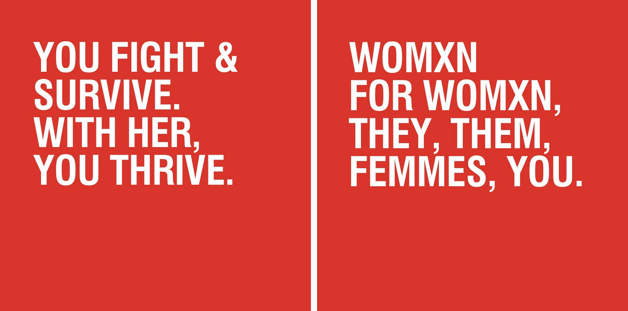
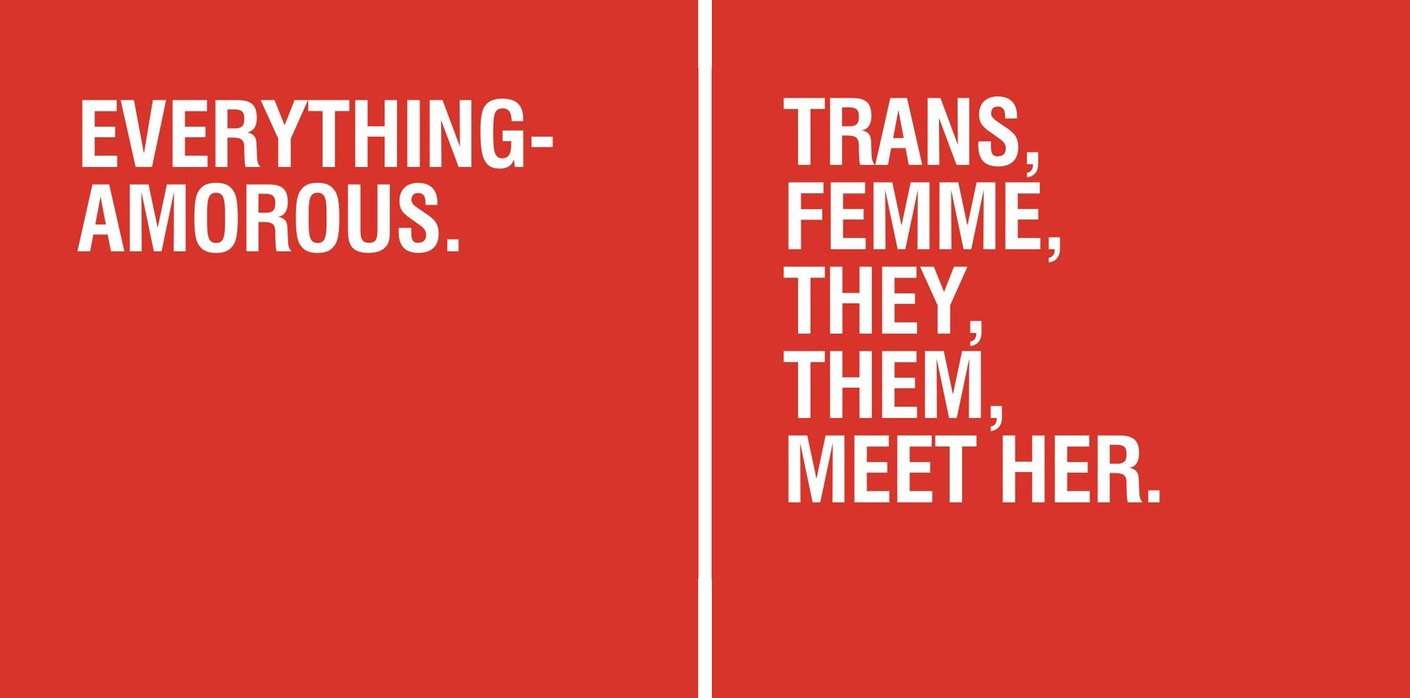
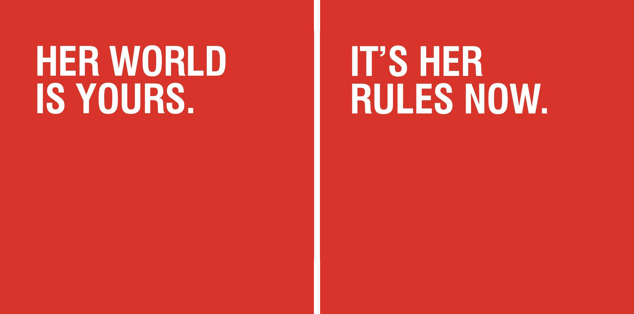
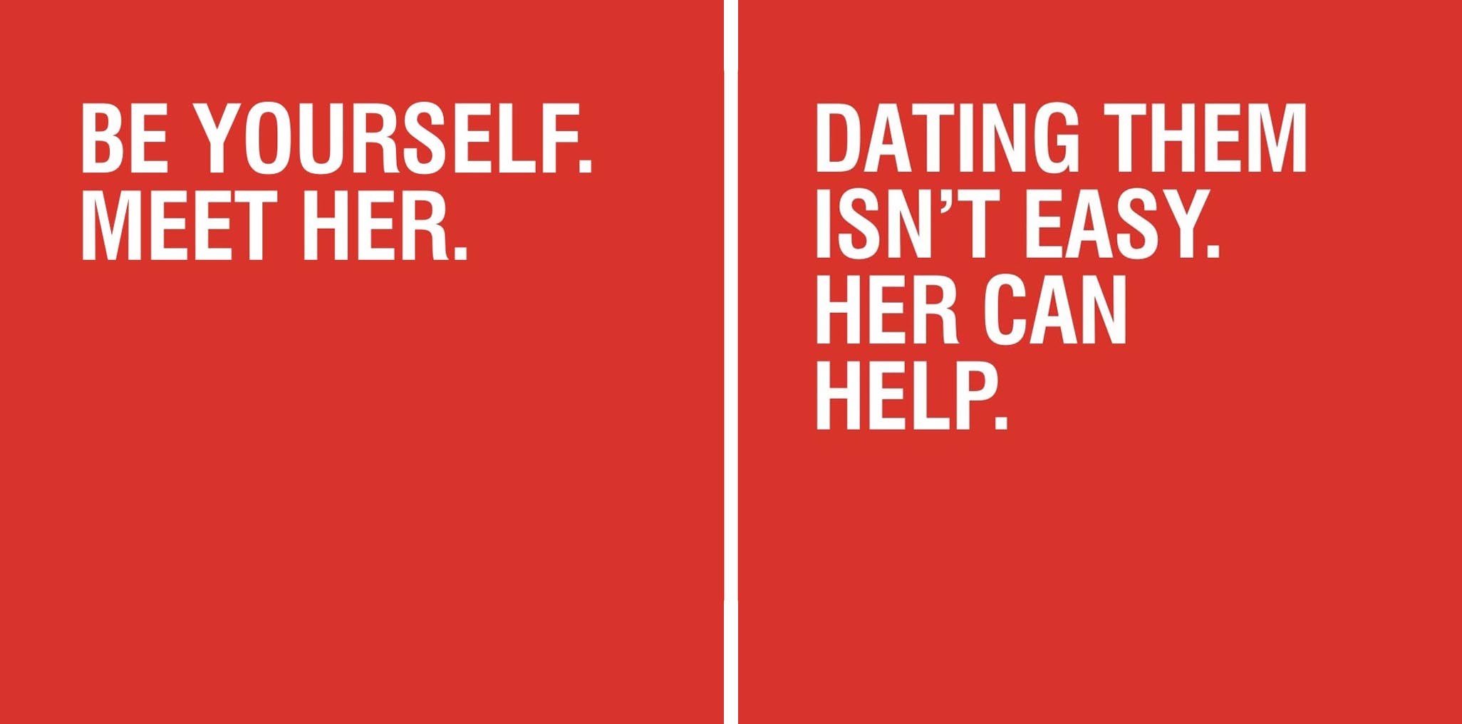
Tone of Voice
As a part of the brand process, I crafted a tone of voice that encourages queer womxn to explore themselves and live fearlessly in the world, and matches the confidence and future-facing outlook of the visual branding.
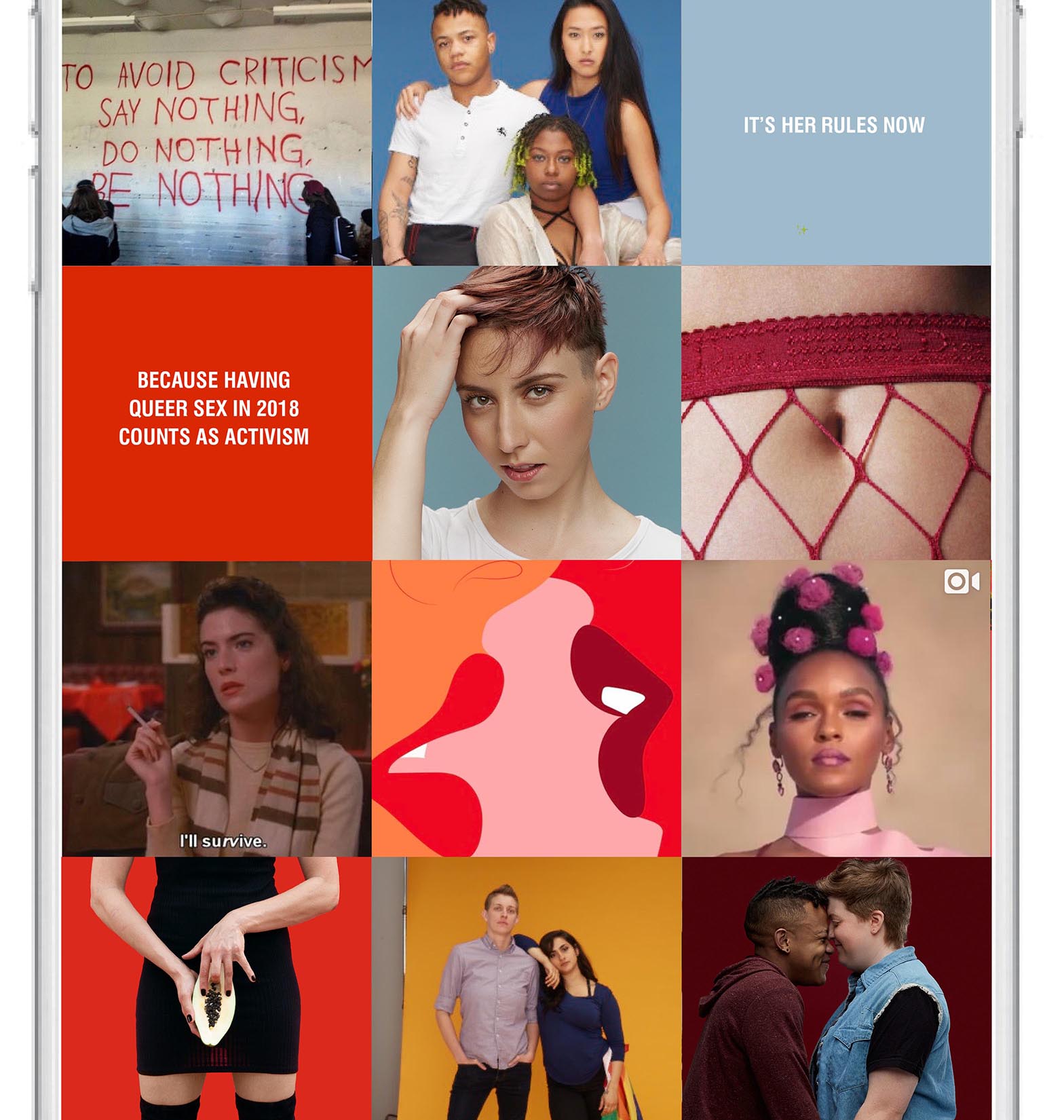
Her's new instagram grid strategy employs a rainbow effect and is bold, vibrant, celebratory and inclusive. As much as possible, it create a dialogue for their audience to engage with.
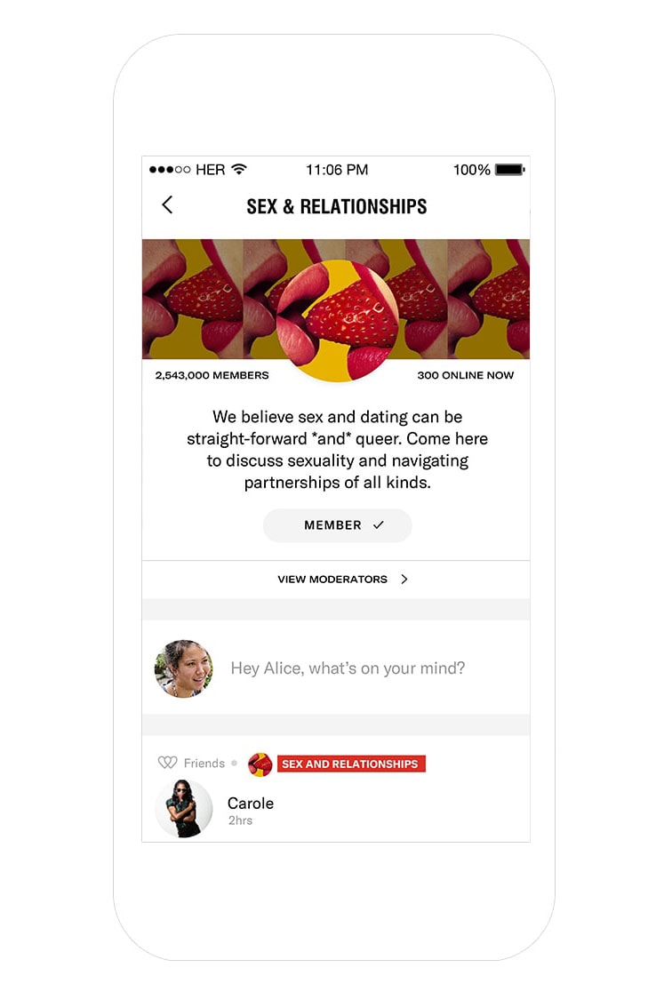
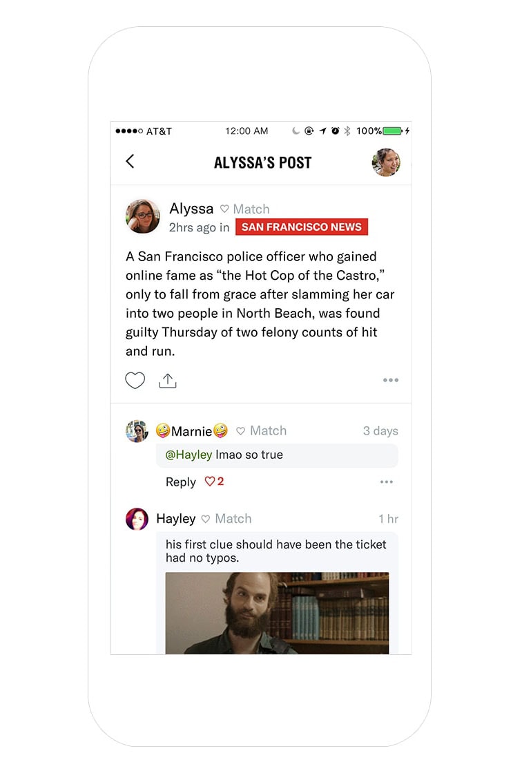
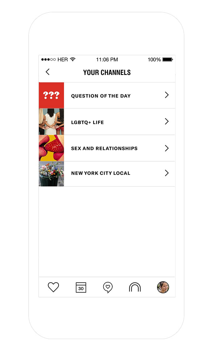
Communities
One of the reasons why Her decided to make a rebrand happen in 2018 was the introduction of communities. These are Reddit-style boards that allow the queer community on Her to engage beyond one-on-one. While working through brand directions, I made sure that the identity could expand itself into community driven, thought-leadership avenues.
The Style Guide
Read about it: